In my post about Mike W. Barr I mentioned that one of the many nostalgic elements in his acclaimed Detective Comics run was the inclusion of surrealist title pages teasing each issue’s themes and plot. Such opening splash pages can be found in comics dating back practically to the beginning of the industry and remained a staple feature of the medium for decades, even if they had mostly fallen out of fashion by the mid-to-late 1980s, when Barr’s artists briefly reintroduced them. Naturally, the most imaginative samples came out during the whole Silver Age psychedelia. As this post will show, however, title pages were quite quirky already in the Golden Age – which shouldn’t surprise, after all we’re talking about an era in which Batman once fought a d’Artagnan lookalike who was holding a whale for ransom at a thousand dollars a ton.
Placed in the beginning of the story, the function of this kind of splash pages is to lure readers in by giving them a sneak peek of the main conflict even before the setup – an alternative to the classic strategy of starting in mid-story and quickly moving to a flashback. The initial image, along with the overblown captions, will sometimes try to create a sense that the stakes will be higher than ever, promising a life-changing experience, or at least intrigue the hell out of impressionable readers with some shocking or bizarre premise, leaving us no choice but to turn the page in order to satisfy our curiosity… only to find out that – more often than not – the introduction cheated, its image having little connection to the actual narrative other than at the most symbolic level.
Sticking to the 1940s alone, we can find plenty of intros that are outright puzzling, dream-like, almost poetic, and blatantly misleading – in short, awesome. To give a sense of how cool they were right off the bat (I just couldn’t resist!), here are my 10 favorite examples from Golden Age Batman comics.
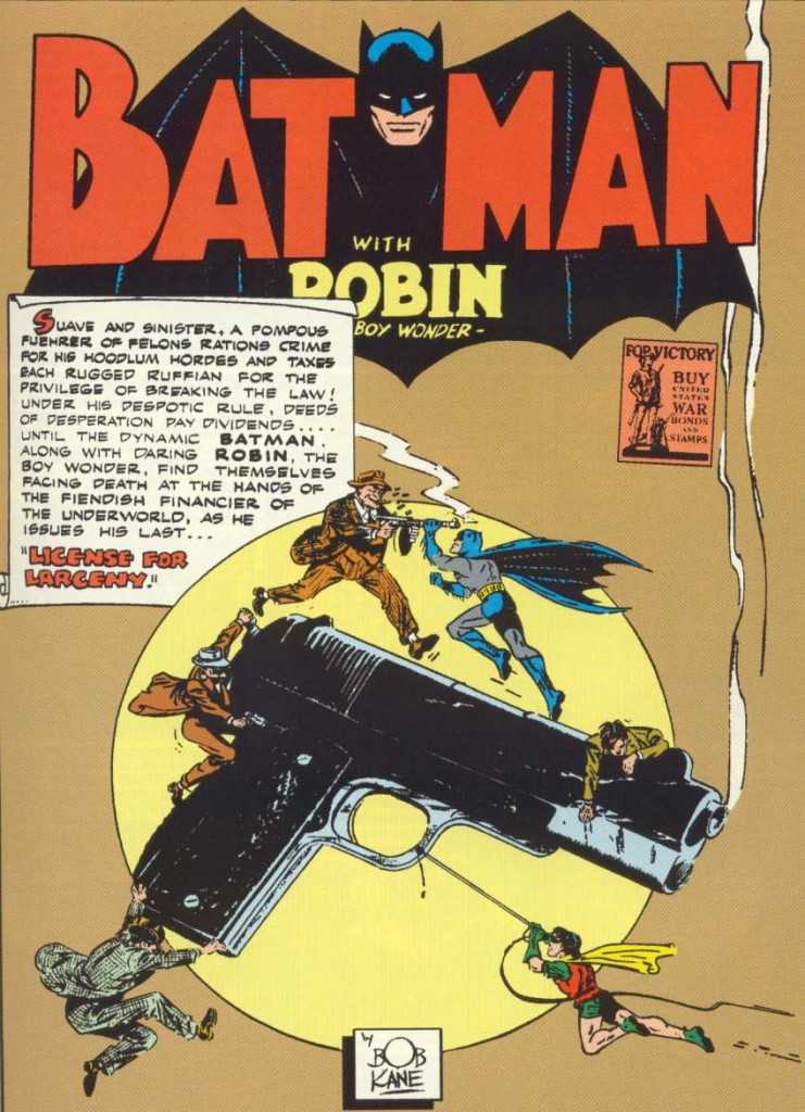 Detective Comics #72
The image of Batman and Robin facing thugs armed with guns on top of a giant gun is so striking that at first you may even miss the small rectangle asking you to buy war bonds and stamps. But even before you notice it, you can easily tell this is a World War II comic because the caption seems to have lifted its characterization of the villain from an anti-Nazi pamphlet, talking of a ‘fuehrer of felons’ with ‘hoodlum hordes’ and a ‘despotic rule.’
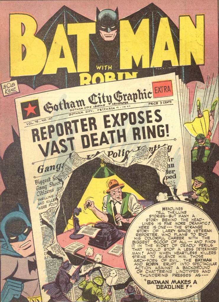 Batman #19
This is one seriously multi-layered splash page. On the forefront, we have the round caption summing up the premise, then there are a bunch of gangsters and Robin in mid-jump, then an oversized newspaper page with a headline about a reporter exposing a death ring, and behind it the reporter himself, who is clearly on another level but is nevertheless able to see the gangsters shooting at him through the torn paper… AND behind it all there is Batman, whose size indicates is on yet another layer, not to mention the comic’s logo at the top, which seems even more distant. The mind boggles!
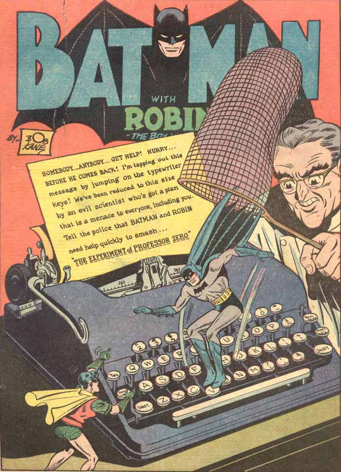 Detective Comics #148
As you may have gathered by now, many of these teaser splashes involve the Dynamic Duo doing acrobatics around giant objects. This one, however, has the particularity of presenting the scenario with a more literal twist – the size difference is no longer allegorical, but the deed of an evil scientist… and the text piece introducing the story’s title is apparently not the voice of the editor, but of the Caped Crusader himself, as he types a rescue note full of melodramatic punctuation…
 Detective Comics #82
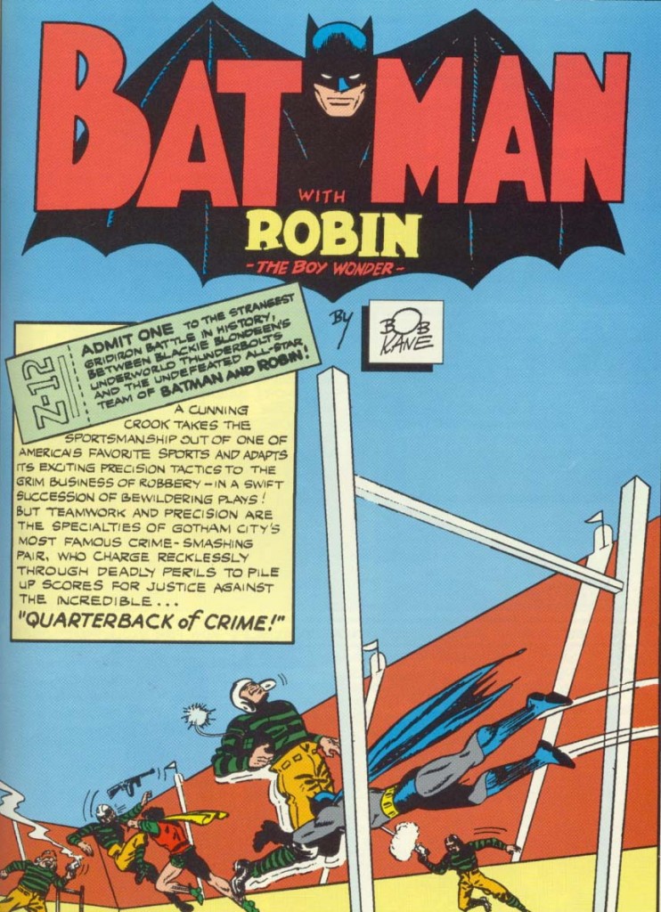
The coolness here is pretty self-explanatory. It’s not the first splash page we’ve seen with Batman and Robin fighting a team of armed goons, but this time the team looks like a freaking football team, in a stadium and all. The caption (part of which looks like a stadium ticket) doesn’t even feel the need to mention the fact that the following story includes an overweight Alfred saving the day by kicking a bomb!
 Detective Comics #71
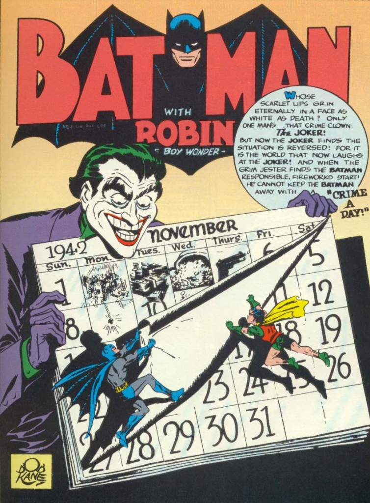
With his haunting features and unconventional plans, the Joker tends to encourage some of the most memorable splashes and this one is no exception. Besides the amazing design composition, I also have a soft spot for the line: ‘He cannot keep the Batman away with a “crime a day!”’
 Batman #16
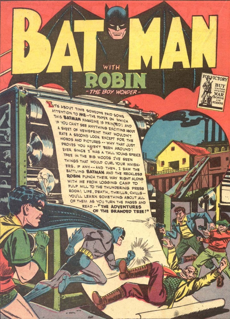
Not only is the introductory text nicely integrated into the image by being written on the piece of paper going to print, it is written *from the perspective* of that paper! The paper, by the way, is so self-aware that it even knows it will end up as a Batman comic.
 Detective Comics #77
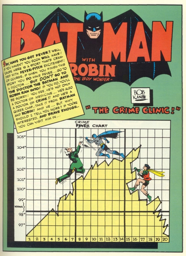
Speaking of eccentric text pieces, this one is all over the place… and just in case the connection between fever and crime is not obvious enough, the art makes it even clearer by actually adding the word ‘crime’ to the top of the fever chart.
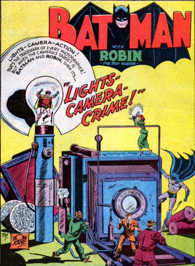 Batman #50
Another page with all the elements: a huge prop, Batman jumping on armed gangsters, corny narration neatly integrated into the image, a title that ham-fists the word ‘crime’ into a common expression and finishes with a gratuitous exclamation mark… plus a female character for once – Vicki Vale – taking a picture of a helpless Robin.
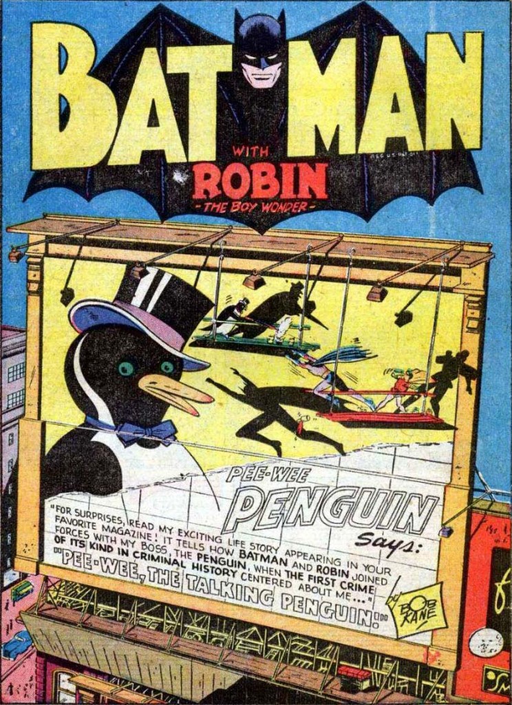 Batman #51
I guess it’s just a matter of time until Pee-Wee, the Talking Penguin, gets the Dark Knight/New 52 treatment and comes back as a brooding, psycho-rapist human-killer out to get revenge on climate change deniers for letting his home melt… we’ll always have this story, though!
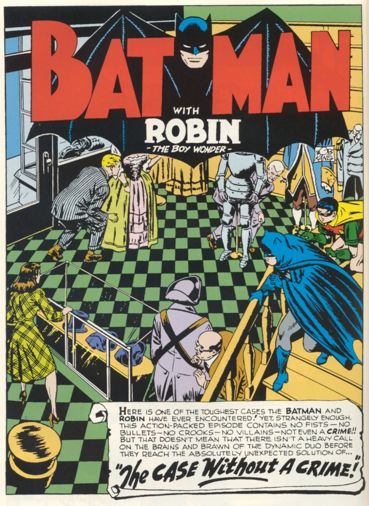 Detective Comics #112
Finally, this one may be my favorite, although it is hard to fully appreciate without context. Not that it’s a bad teaser by itself… the caption and the title are intriguing enough, promising a case that kicks ass despite the absence of fists, bullets, crooks, villains, even an actual crime! But it’s after you’ve read this adorable adventure and come back that you really realise how pitch-perfect the image is, illustrating pretty much the whole plot.
