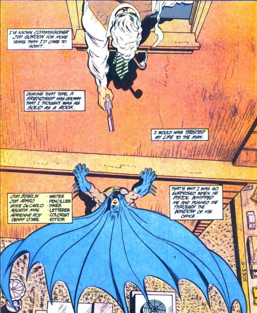
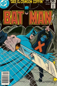
 Batman #415
For some, it may sound odd to describe Jim Aparo’s Batman comics as ‘schlocky,’ given that not too long ago Aparo came in second at CBR’s poll of greatest Batman artists, right after the immensely talented Neal Adams. But I don’t mean this in a bad way. Although his unmistakable style sometimes fell flat, even at its weakest Aparo’s straightforward, unpretentious storytelling and workmanlike approach were a perfect fit for comics that knew damn well they were disposable junk and weren’t trying to hide it. More than merely acknowledge the material’s status as schlock, though, his strongest work celebrated schlockiness with a fair amount of gusto, as Aparo proved capable of turning the silliest scripts into straight up shit-your-paints horror, outlandish satirical sci-fi, and over-the-top action/adventure. He was the John Carpenter of Batman artists, minus the synths.
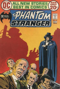
In many ways, Jim Aparo had a lot in common with Neal Adams… Their renditions of the Dark Knight were athletic yet drawn with realistic proportions and, in both cases, their artwork really peaked in the 1970s (back when Aparo not only pencilled, but also consistently inked and lettered his own work). Moreover, as in the case of Adams, my all-time favorite Aparo cover is actually from The Phantom Stranger:
And yet, while Neal Adams was doing ‘social relevance’ stories featuring Green Lantern and Green Arrow, written by the liberal Denny O’Neil, Jim Aparo was cranking out deranged exploitation horror starring the Spectre, written by the misanthropic Michael Fleisher. If Adams pushed the boundaries of superhero comics and instilled his work with a certain degree of elegance and self-importance, Aparo seemed more like the guy you’d turn to when you wanted your book to scream: ‘trashy entertainment and proud of it!’
No wonder Jim Aparo felt so at home during his long run on the team-up book The Brave and the Bold (1971-1983), a series with a definitive B-movie spirit, featuring tales with titles such as ‘Gotham Bay, Be My Grave!,’ ‘The Corpse That Wouldn’t Die!,’ and ‘Disco of Death!’
As I pointed out a few of weeks ago, the defining feature of The Brave and the Bold was that writer Bob Haney never let anything get in the way of a good story, particularly not trite things like continuity, or even plain logic. This was perhaps never more so than in the issues pairing up Batman with the gung-ho, all-American, cigar-chewing Sgt. Rock… Haney established in ‘The Angel, the Rock and the Cowl!’ (with art by Neal Adams) that, even though this version of Bruce Wayne looked like he was in his thirties by the late 1960s, Batman had nevertheless met Sgt. Rock while fighting as a spy for the Allies in World War II. Haney then went on to pen several bewildering tales about this unlikely duo. Jim Aparo not only illustrated the one where Batman *literally* sells his soul to Adolf Hitler (The Brave and the Bold #108), but also one in which Aparo himself saves Batman’s and Rock’s life:
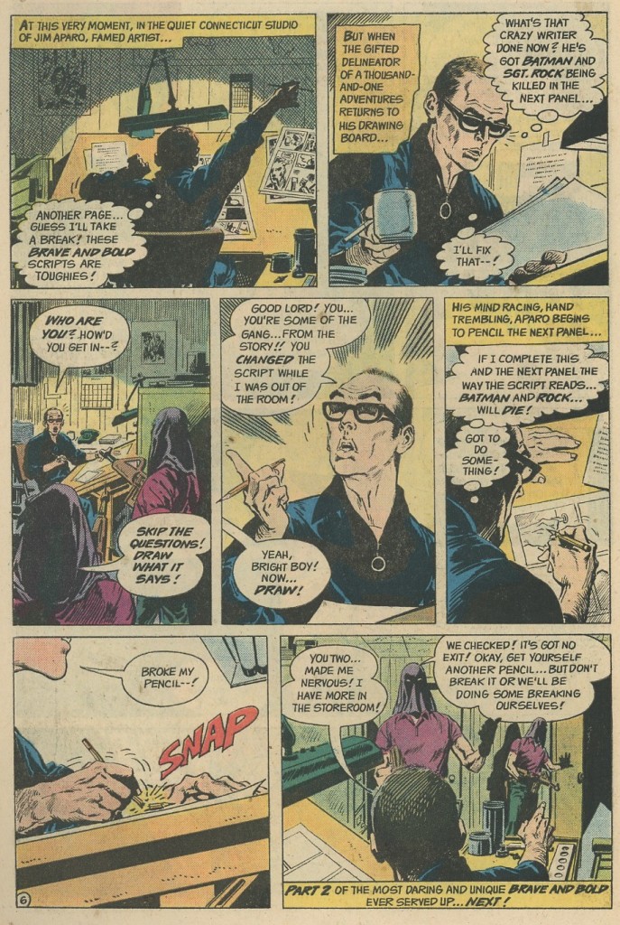 The Brave and the Bold #124
It’s so awesome to see Bob Haney throwing all these crazy ideas around, framing them in the most balls-out and hyperbolic terms, and then Jim Aparo just running with it and playing them completely straight. If anything, Aparo’s no-nonsense art seems to work best the more hectic and bizarre the stories get, creating a fascinating contrast.
I don’t mean to imply that Aparo’s draftsmanship was entirely devoid of stylized pyrotechnics. In fact, his art during this period had a vibrant authorial voice. As he points out in this interview, Aparo liked to draw geeky easter eggs in the background, including celebrity cameos and clues about the upcoming guest stars. There was also the occasional experiment in terms of page layout…
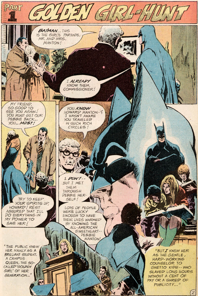 The Brave and the Bold #115
The main thing that stood out in Jim Aparo’s comics, though, was the abundant use of Dutch angles. Seriously, it’s like the ‘camera’ never stopped moving – his predilection for skewed shots, coupled with his rugged inks, helped infuse The Brave and the Bold with an intoxicating brew of grounded grit and dynamic visuals.
Aparo complemented this device by penciling letters in all sorts of counter-intuitive directions, which really pulled your eyes across the page, turning text-heavy sequences into a forceful, energetic reading experience:
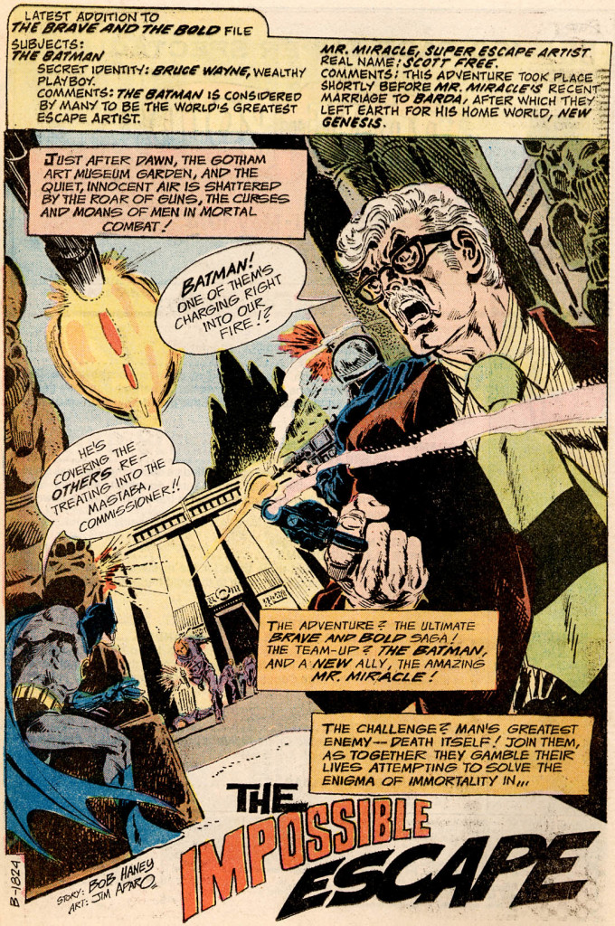 The Brave and the Bold #112
As you can see from the example above, one thing Jim Aparo excelled at was packing tons of details on the first pages of an issue while still delivering a slam-bang opening that drew you in!
Here are another couple of vertiginous, adrenaline-pumping openings, from a classic issue of The Brave and the Bold and from the compelling mini-series The Untold Legend of the Batman:
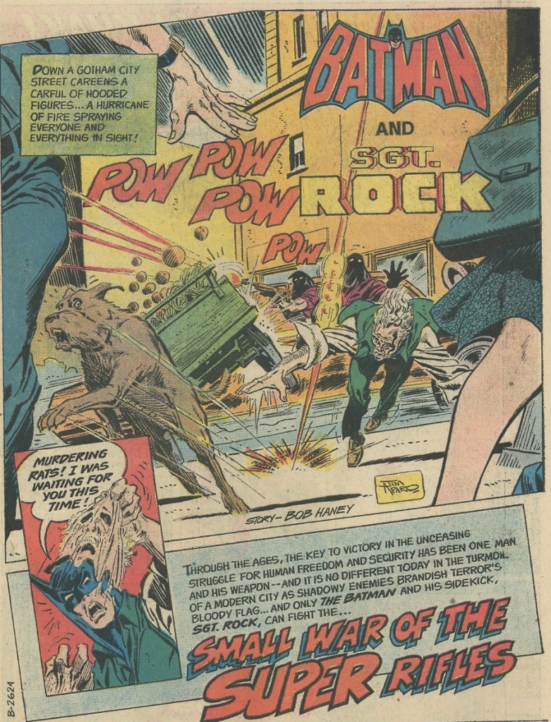 The Brave and the Bold #124
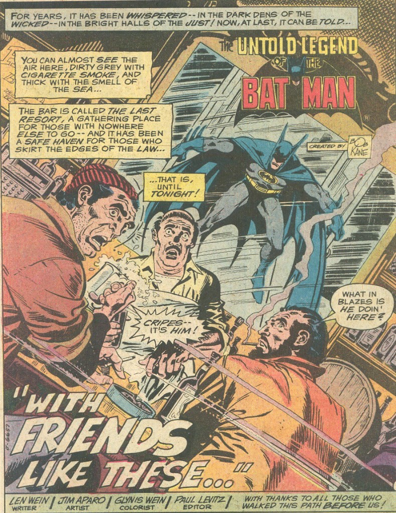 The Untold Legend of the Batman #2
Gradually, Jim Aparo adopted a slightly more minimalist style, with more negative space and simpler yet powerful images. You got the sense that Aparo had pretty much figured out his standard techniques and wasn’t looking for any new challenges. He became a more meat-and-potatoes kind of artist, with a boilerplate aesthetic, just applying what had worked so far into whatever he was asked to draw.
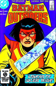
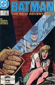
This attitude may explain why, unlike Neal Adams (who seemed to take himself more seriously), Jim Aparo stuck around for so long. Notably, in the 1980s he co-created – with Mike W. Barr – Batman and the Outsiders, an uneven superhero series with the schlockiest stories about the nuclear threat this side of Joseph Ruben’s Dreamscape. Later in the decade, he illustrated Jim Starlin’s infamous run on Batman, which included ‘Ten Nights of the Beast’ (a take on the Reaganite action sub-genre that Cannon studios specialized in) and ‘A Death in the Family’ (the story arc in which the Joker beat Robin to death with a crowbar).
By then, Jim Aparo’s art had grown noticeably stiffer. He stopped inking his own pencils, which became way too clean and boring for my taste – they lost much of their appealing roughness and sense of urgency. His limitations were also more apparent. For example, although Aparo had a range of facial expressions…
 Batman #414
…when he was tasked with long stretches of drama, his characters usually felt like they were chewing up the scenery.
Check out all the ‘overacting’ in this scene:

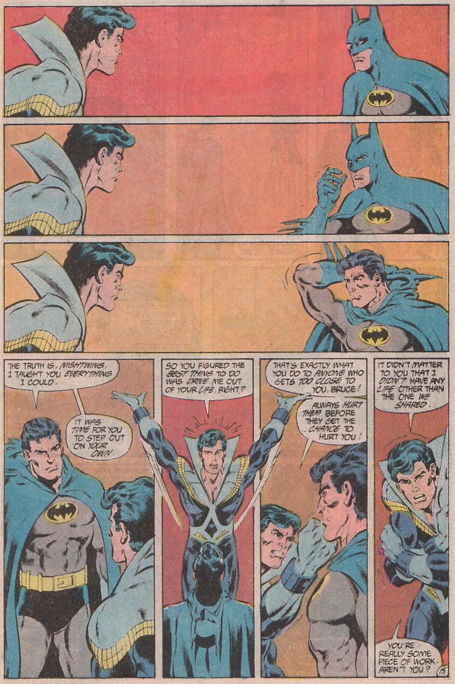 Batman #416
Regardless, Jim Aparo was acknowledged as a master storyteller and you could see writers trusted him. In Batman #431 (which came out in 1989), written by James Owsley (aka Christopher Priest), Aparo got to illustrate a neatly choreographed eight-page fight scene with ninjas that brings to mind the stylish intensity of those dimly lit fights in the Daredevil show. Shortly thereafter, he drew the quasi-wordless Batman #433, from a script by John Byrne. In this issue – the first part of ‘The Many Deaths of Batman’ story arc – Batman dies and we see the reactions from various characters, with all of the narrative and pathos hinging on Aparo’s mise-en-scène and body language.
With his old-fashioned figures and clear transitions, the man could definitely carry an effective narrative. It was only when he was asked to design new characters that what he came up with tended to be somewhat embarrassing. As if the Masters of Disaster and the KGBeast weren’t bad enough, there was the case of Metalhead:
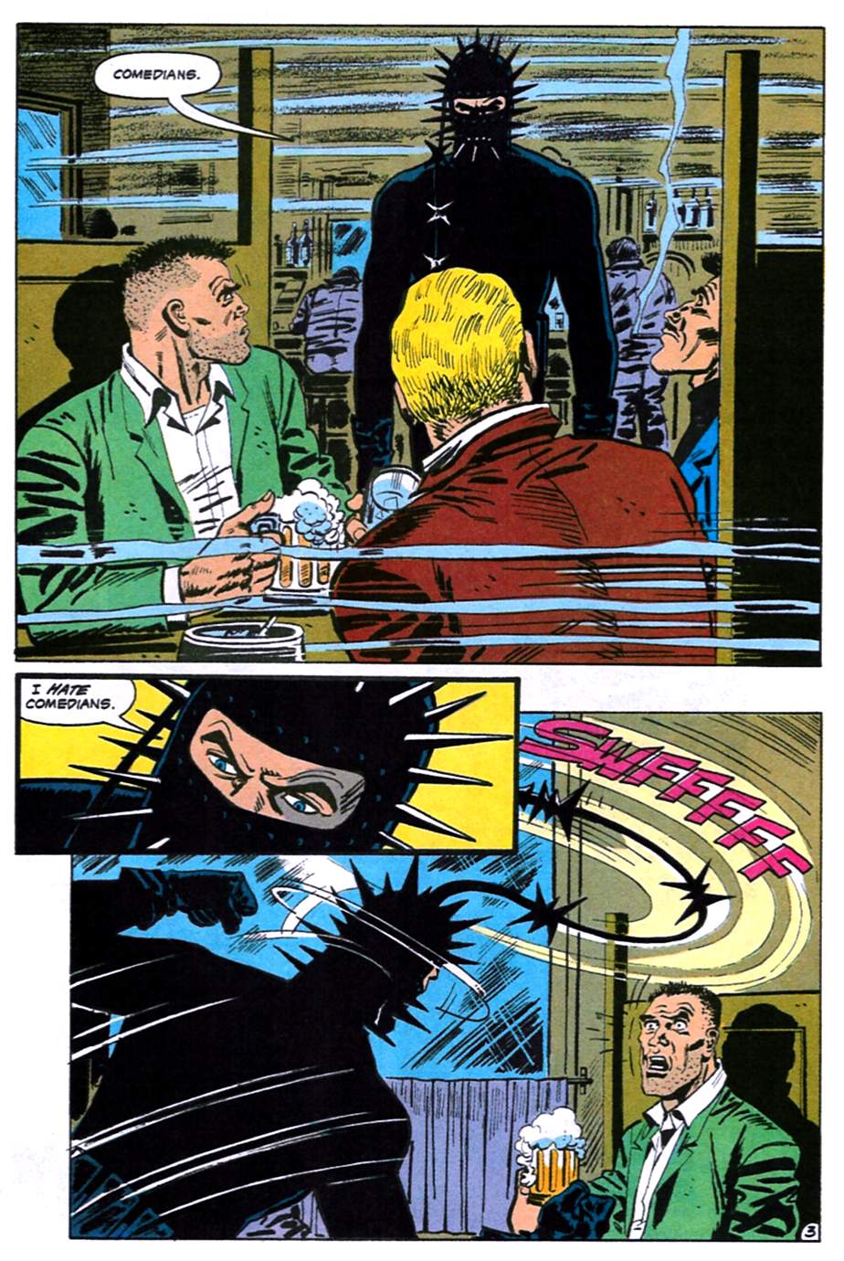 Batman #486
That said, in 1991 someone had the inspired idea of assigning Jim Aparo with bringing to life Peter Milligan’s scripts. With a surrealist streak and a tongue-in-cheek sensibility, Milligan gave Aparo plenty of intentionally offbeat stuff to draw, bringing back some of that Brave and the Bold magic… For example, in ‘And the Executioner Wore Stiletto Heels,’ the Dark Knight found a paraplegic snitch glued to the ceiling:
 Detective Comics #630
Other than that, throughout the 1990s Aparo remained that reliable artist who, while not expected to produce anything outstanding, was always sure to deliver a competent yarn. After significant contributions to the high-profile ‘A Lonely Place of Dying’ and ‘Knightfall’ storylines, Jim Aparo turned into a fill-in artist for when creators just wanted to tell a solid little one-off, whether it was a crime story (Shadow of the Bat #61), a horror tale (Shadow of the Bat #68), or a mix of both (Detective Comics #716).
By 1998, Aparo’s style had become so identified with the default look of Batman’s world that ‘Sound and Fury’ (Detective Comics #719) used it to visually distinguish fact from fiction in a prisoner’s fanciful account of a heist – the reality was penciled by Aparo and the fantasy sequences by Flint Henry, whose drawings were much more exaggerated and grotesque. That year, Alan Grant and Mark Buckingham sort of paid homage to the veteran artist in Shadow of the Bat #75, where Batman defeated Clayface by crushing the villain with a huge billboard that read ‘Aparo Originals – Need we say more?’
Honestly, I don’t think the 1990s’ inking and coloring trends gelled very well with Jim Aparo’s pencils – the result tended to be passable, but it rarely jumped off the page like it used to do in the old days… That said, there were some interesting exceptions. For example, Bill Sienkiewicz’s inks managed to give Aparo’s work a distinctive look. In 2001, inker John Cebollero and colorist James Sinclair did a stellar job with Aparo’s final Batman comic, ‘The Demon Laughs’ (Legends of the Dark Knight #142-145) – about a twisted team-up between the Joker and Ra’s al Ghul – where his art felt less anachronistic than it had done in years!
All in all, Jim Aparo was a quintessential artist of Batman comics at their schlocky best and worst. I’ll finish by pointing out that Aparo was not just great at crafting alluring opening pages, he also knew how to pull off a moody ending:
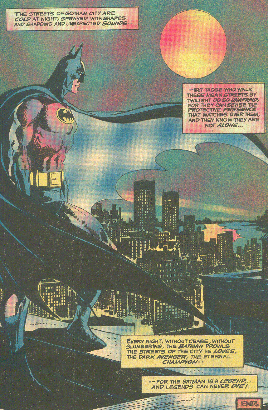 The Untold Legend of the Batman #3
NEXT: Fantastic adventures.
An excellent retrospective on one of the greatest workhorses of the Batman franchise, Sir. I’ve never overcared for Aparo’s art even during his “good” period, but whoever thought to team him with Peter Milligan during the ’90s deserves a dozen medals. That said, I beg to differ on one thing – “The Demon Laughs” is one of the ugliest-looking comics I’ve ever seen in my life, due in no small part to the inks. According to Chuck Dixon the thing was originally inked by Graham Nolan, and what I wouldn’t give to have seen *that* version of the story…!
(I’ve stumbled across this blog quite a lot while doing research for my own blog, but never quite had the inclination to sit down and read the whole thing through. That changes… tomorrow, ’cause I’ll be hitting the hay soon.)
I didn’t know ‘The Demon Laughs’ was originally inked by Graham Nolan… I’m sure that would’ve looked nice!
Still, I love the Joker’s look in that comic – especially in the amusing opening scene and, later, when he briefly regains his sanity. John Cebollero (who also did the tremendous covers) makes the Joker feel like a modern yet rugged incarnation of the classic Aparo design while nailing his various mood swings in the final part of the story.
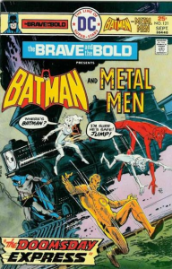
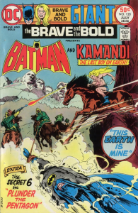
Three of Aparo’s BEST covers: Brave & Bold 119, the cover for Detective comics that wrapped up the Manhunter series (“Gotterdamerung”) — a cover that was used as the basis for a DC black and white statue –and the cover for a Batman Special — one of those huge, over-sized books by DC, on villains, with Batman standing dramatically o a rooftop, framed, on one side, by spotlight images of Two-Face, the Joker, Catwoman and the Penguin. Classic!!
I’m a big Aparo fan so this was a nice trip down memory lane. Regarding when Bill Sienkiewicz inked Aparo, it was during the artist’s decline near the end of his life. DC brought Sienkiewicz in to “fix” Aparo’s work. There is a video on YouTube where Sienkiewicz talks about Jim calling him up and telling him to quit f**king with his faces!
https://www.youtube.com/watch?v=2KSxqOL7H4A
Out of the very very few DC comics I still own the art and story in “The Brave & the Bold” #111 is still an excellent example of Jim angles, shading an exaggerated Bat ears. love it. RIP
loved aparo’s classic bronze age work, hated his “meat and potatoes” phase, especially the lack of backgrounds and atmospheric heavy black inks characters like batman demand.
i still have a number of bronze age brave n’ bolds, including #124. if you had the power to write and draw any character into reality, how long could you resist writing yourself into a porno with your favorite character(s)? just asking for a friend …
If you haven’t realized it by now, the resurgence of interest in Aparo’s art — DC’s hardcover reissues of a LOT of his old art, and the titles featuring it — should underscore how wrong you were (and still are). I used to think Adams and Aparo were fairly equal, with the former outweighing the latter. But when you look over the work, Aparo actually had an innate sense of composition that declared itself on the page. And from 1973-1980 or ’83, there was no one better. His covers for “Detective”, the work he did on “Spectre”, “Phantom Stranger”, “Brave & the Bold” and “Aquaman” (sometimes simultaneously) is unequaled. As for the “Dutch” angles: only someone who didn’t understand and appreciate Hitchcock would complain about that! Schocky? Only this column fits taht bill.
I must admit I’m a bit baffled… I get it that not everyone finds the notion of ‘schlocky’ as endearing as I do, so my praise for Aparo’s 1970s’ work may be somehow misread, but what made you think this was a *complaint* about Dutch angles: “his predilection for skewed shots, coupled with his rugged inks, helped infuse The Brave and the Bold with an intoxicating brew of grounded grit and dynamic visuals”?
Big Aparo fan here. I grew up with him esp. as a child and teen of the 1970s, but didn’t really start to appreciate his artistry until the 1980s in college as an art student. For me, his peak was, say, from 1971 to 1976, whether it be Batman, Aquaman, the Spectre or the Phantom Stranger, etc.: the era of his more richly illustrative, realistic style and before the more minimalist style first began to take root in the later 1970s (I also thought part of this initially might be the economic difficulties the comics industry was having that decade esp. with publishing costs where by the later 70s, the printing plates were plastic and paper may have even been cheaper–as the image quality in comics by 1977 looked different–not having the same polish, nor color finesse nor line detail– the thinly inked lines that could not hold up under the presses with the cheaper plastic. Why put in the rich detail at that point?).
I loved Aparo’s sense of craftmanship–pencils, inks and letters–and how he seemed to give careful consideration to the placing of all it–as you note, even the lettering and speech balloons and narration panels always seem carefully thought out in terms of placement. His inking had a wonderful calligraphic sense that looked elegant and gutsy at the same time (a big influence on me in art school as I took up pen and ink) and his ability with his rich shadings and cross hatchings to do dark or macabre stuff was amazing. And I felt, even with the wonderful Dutch angles, he was never guilty of Adams’ sometimes melodramatic excesses. (And Adams only really looked the best when Dick Giordano inked him–when he inked himself, he seemed sometimes a bit too loose or sloppy at times. Aparo was the better inker). In terms of beautiful illustrative realism, and that inking great inking, some work that stands out for me include Brave and the Bold # 110 (Batman & Wildcat, 1973 / 1974) and esp. Brave and the Bold # 114 (Batman & Aquaman, 1974)–my favorite–both the interactions of the two heroes and the choppy ocean imagery is outstanding! Also Adventure Comics # 443 (Aquaman, 1976) and Phantom Stranger # 24 (vol. 2, 1973).
While Aparo could often be thought of as an “Adams imitator” with his illustrative realism (he admitted the influence, but the idea he was just a mimic was unfair–you could always tell his distinctive work apart from Adams–no Rich Buckler he), I sometimes wondered if the influence also went the other way. Batman # 255, (which I bought in 1974) featuring the Adams / Giordano rendered “Moon of the Wolf,” shows such exquisite inking in terms of calligraphic touches (the thick v thin contrasts of the lines), fine hatching and rich shadings–and the coloring of the original newsprint gives some of the images an amazing photo-realist quality–that I’ve wondered if Aparo was an influence on the noted illustrative pair (Aparo noted that Adams took interest in his work). Who knows–but I’d like to think so.
Apologies for length–but I’m a big Aparo fan.
Thank you for this rich analysis. I love the explanation for Aparo’s turn towards minimalism – I’d never thought about it like that but it makes a lot of sense!
Sorry to the fans, but Jim Aparo is my least favourite artist of all time. When I was a kid during the 80s, I bought Batman comics with cool covers time & time again, only to find boring, flat, repetitive and frequently ugly art inside. His version of Batman is the worst; plain & unexciting. Hate his style. It was interesting to see in this article his early work was better. Most artists improve over time. It’s like he settled back into a low effort rut which DC were happy to support for years & years. Batman is my favourite character but Aparo basically ruined the comics for me during his very long run.