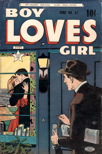
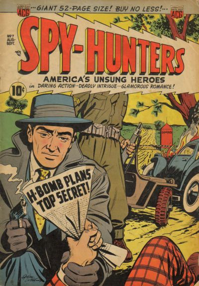
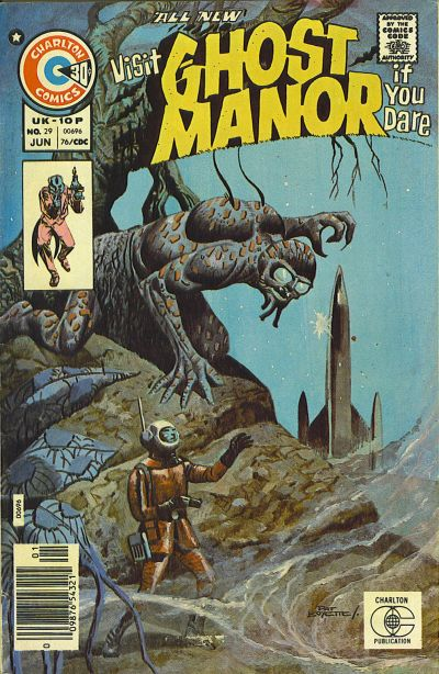
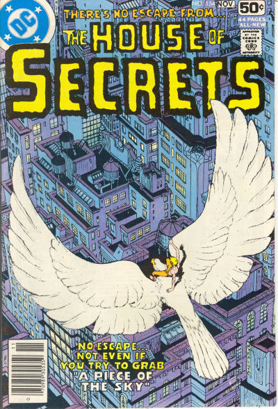
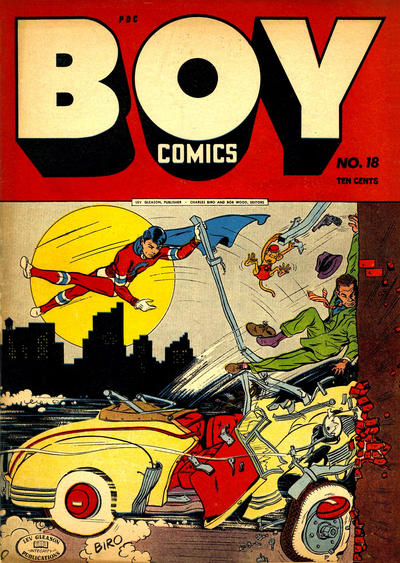
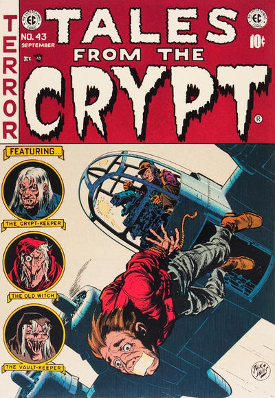
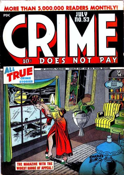
Another Monday, another reminder that comics can be awesome. This week, I’ve tried to spotlight covers that show the power of layouts and composition in bringing out the appeal of different genres, from the dynamism produced by lines pointing in multiple directions to the information conveyed by strategically placed details, not to mention the tension that can be created through a precise mise-en-scène (like the reflection in the mirror in the very last cover)…
-
Recent Posts
Categories
- ART OF BATMAN COMICS (35)
- ART OF HORROR COMICS (32)
- AWESOME COVERS (53)
- BATMAN COMICS FOR BEGINNERS (34)
- BOOKS OF THE YEAR (17)
- COLD WAR CINEMA (12)
- COVERS OF BATMAN COMICS (51)
- FANTASTIC ADVENTURES (51)
- GLIMPSES INTO AWESOMENESS (81)
- GLIMPSES INTO THE FUTURE (19)
- GLIMPSES INTO THE PAST (76)
- GOTHAM CITIZENS (37)
- GOTHAM INTERLUDES (85)
- HARDBOILED CRIME (38)
- HEADSHOTS (10)
- MANIFESTO (3)
- POLITICS OF BATMAN COMICS (21)
- SPYCRAFT & WARFARE (42)
- SUPER POWERS (15)
- WEBS OF FICTION (54)
- WILD WEST (7)
- WRITERS OF BATMAN COMICS (20)
- WRITERS OF SUPERMAN COMICS (4)
Drop me a line at
imbaytor@yahoo.com
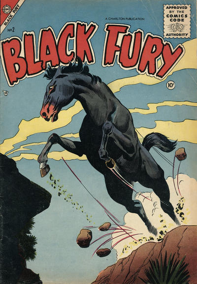
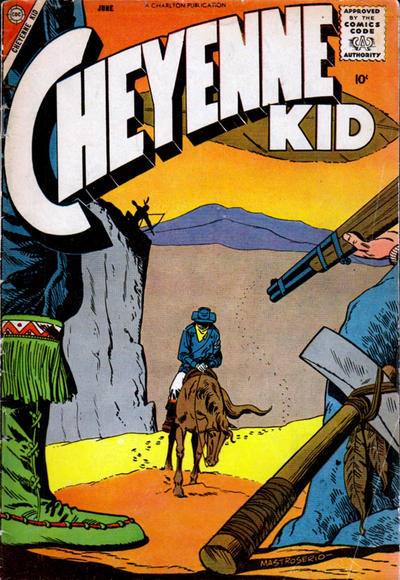
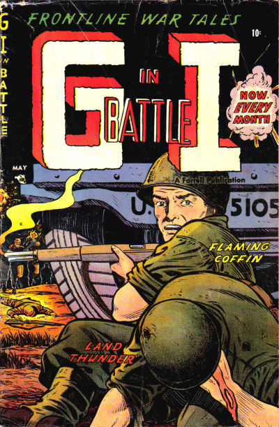
The Cheyenne Kid cover is my favorite of this batch. Any favorite Western comics that have just as good interiors?
Although the style is somewhat different, when it comes to visuals, I recommend any western drawn by Hermann
Thank you, I will check him out!