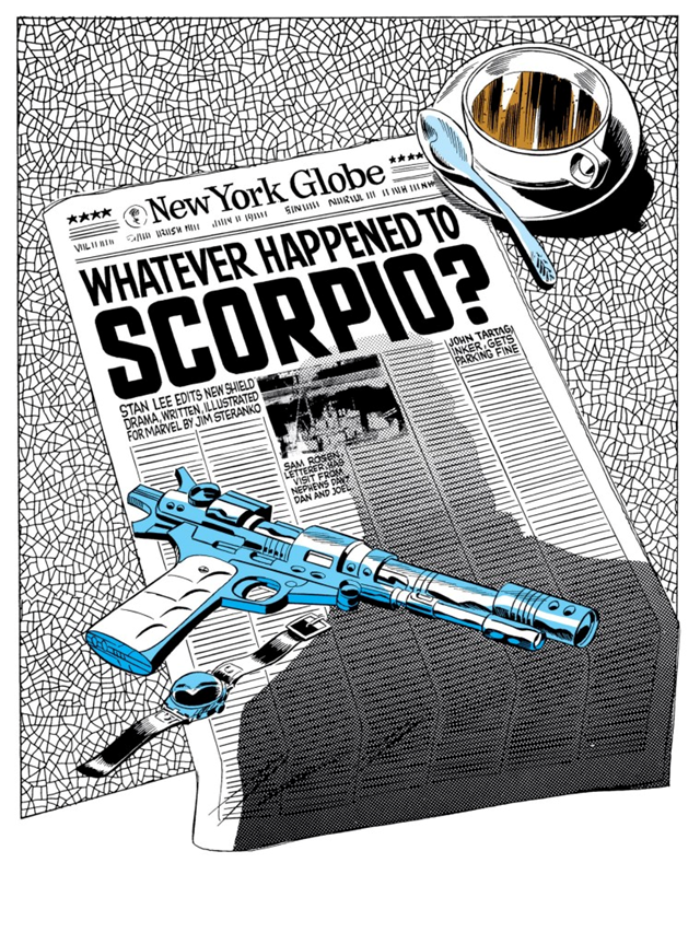
In 1966, Jim Steranko took over the adventures of Marvel’s secret agent Nick Fury. The result was one of those comic book runs in which a creator was able to carve out a personal project at the core of the industry, imbuing it with so much enthusiasm, energy, and creativity as to revolutionize not just that specific series, but the entire medium.
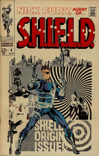
Jim Steranko started by working over Jack Kirby’s layouts in the anthology Strange Tales until finally being allowed to fully illustrate and, soon, write Fury’s stories, leaving a strong mark on the series. In a way, just like Hydra was in the process of infiltrating S.H.I.E.L.D. by the time Steranko joined the book, so did Steranko – who was as eccentric as his creations – infiltrate Nick Fury and surreptitiously subvert it while establishing creative control of all aspects of the comic: he gradually became the rare creator of the period to write, pencil, ink, color, and sometimes even letter his own work.
As Steranko explained in the introduction to 2009’s collection Marvel Masterworks: Nick Fury, Agent of S.H.I.E.L.D., volume 2, he began to implement his artistic vision with the splash page on Strange Tales #154 (already fully drawn and plotted by Steranko, yet still scripted by Roy Thomas) and never stopped pushing the envelope, aborting Marvel’s classic page division and panel configuration, replacing them with narrow horizontal and vertical panels that generated visual tension and smaller panels that enhanced his control of temporal pacing.
As indicated by the intricate electronic cluster covering the walls on the aforementioned splash – not to mention the detailed cross-section cutaway of the Helicarrier in the following page – Steranko fully embraced the fact that technology was ultimately the series’ major motif. If anything, his run was even more upfront about it than what came before, taking the comic’s spy-fi credentials to new extremes: his early issues featured the supercomputer AUTOFAC (Analytical Unit for Tabulation of Origin Factors And Computation), a gamma ray attack (colored in black & white), a vortex transporter beam, the Q-Ray molecular disruptor, a saucer ship called Dyno-Soar, invisibility pills, the Techno City in Hydra Island (an almost abstract set of spires and conical needles, introduced as a ‘colossus of steeples and pyramids, of turrets, domes, and obelisks – like towering evil fingers of steel and glass, reaching upward as though to blot out the very stars above!’), an Epiderm-Mask face-changing machine (shades of Mission: Impossible), and a Hallucination Cube (complete with a ‘mind-bending vapor,’ fueling the first full-on surrealist splash, in Strange Tales #157), among many other gonzo gadgets and concepts…
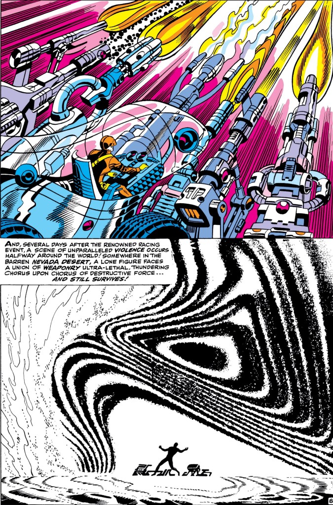 Nick Fury, Agent of S.H.I.E.L.D. #1
An absolute master of dynamic composition and design – and a full-time art director at an advertising agency at the time – Jim Steranko contributed with a myriad of innovations to the language of mainstream comics. Even when the techniques themselves were not entirely new, the ingenious way Steranko combined them and integrated them into the Marvel house style certainly was. Between the elaborate collages, the rhytmic panel transitions, the hypnotic flow of his layouts, the backgrounds filled with optical illusions, and the sexy, eye-popping color schemes, I really cannot emphasize enough how groundbreaking Steranko’s work was, although a look at the pages above and below (from issues that came out fifty years ago!) should begin to give you a clue….
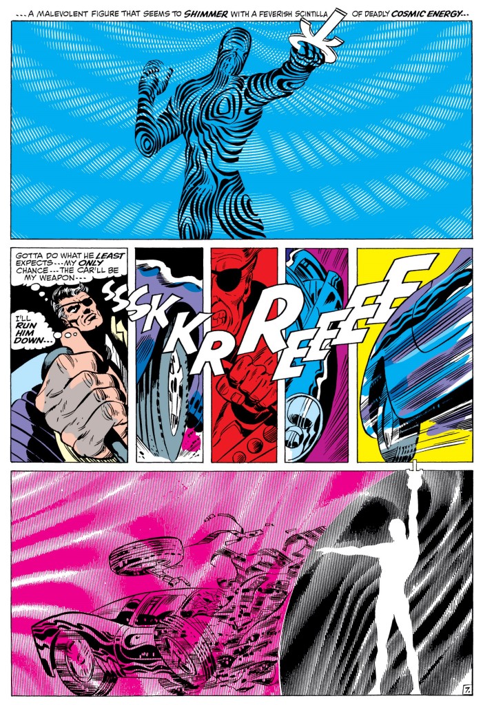
Nick Fury, Agent of S.H.I.E.L.D. #5
To be sure, the storytelling in Steranko’s earlier Strange Tales issues was still relatively crude. Even in the later ones, you can find some cringeworthy dialogue as well as an uncomfortable orientalist villain by the name of Yellow Claw. However, it was hard to miss the expanding levels of far-out experimentation, from Nick Fury’s break-in into the Yellow Claw’s ship (where panels turn in all sorts of directions) to the panoramic four-page spread in Strange Tales #167.
The boldest moves, though, took place once Jim Steranko moved from twelve to twenty monthly pages, in 1968, as he was allowed to go wild in a full length Nick Fury, Agent of S.H.I.E.L.D. ongoing series. Steranko took great advantage of the format, opening the proceedings with a classic silent sequence and delivering stunning splash pages such as these two Eisner-esque beauties:
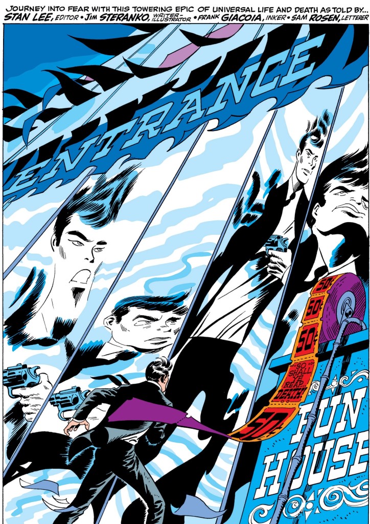 Nick Fury, Agent of S.H.I.E.L.D. #2
Nick Fury, Agent of S.H.I.E.L.D. #5
In his mandatory book Secret Identity Crisis: Comic Books & the Unmasking of Cold War America, Matthew J. Costello argues that the replacement of Kirby’s contained frames by Steranko’s ‘own style in which frames bleed into one another, characters frequently overreach the gutter, and increasingly psychedelic effects become prominent’ reflects the blurring of the moral certainty surrounding Cold War images and actions, the political consensus of previous years now fading into greater ambiguity. Likewise, the fact that the stories were populated by heroes pretending to be villains or vice-versa, multiple secret identities, constant unmaskings, and even Fury’s Life Model Decoys, evoked the crisis of identity in US society over who were the real heroes and enemies as the turbulent ‘60s drew to an end.
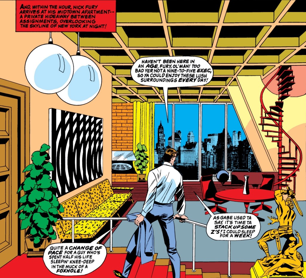
Speaking of identity crisis, Jim Sternako was also responsible for modifying Nick Fury’s persona, distancing the character from his origins as an old-school, gruffy WWII grunt and bringing him more in line with the well-groomed coolness of a James Bond or a Derek Flint.
Strange Tales #159
If, in the Kirby/Lee run, the unsophisticated image and attitude of the director of S.H.I.E.L.D. had been the cause of tension and disapproval by the political elites, under Steranko he finally became what those elites wanted all along – Colonel Fury now wore Ivy League suits, smoked cheroots, and decorated his apartment in Danish Modern. Plus, in Strange Tales #156, he premiered a form-fitting black leather zipsuit that he continues to wear to this day.
Not that Nick Fury didn’t remain hardboiled as hell:
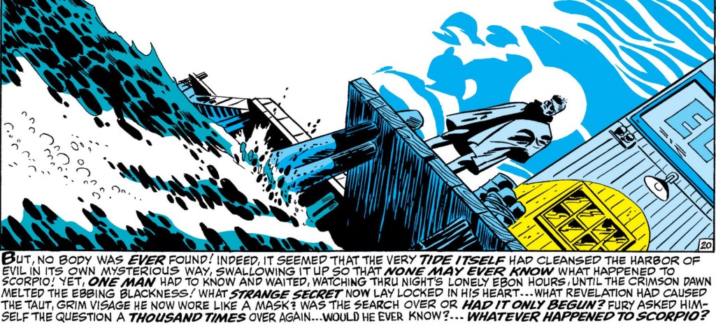
Nick Fury, Agent of S.H.I.E.L.D. #5
Besides the obvious riffs on the super-spy subgenre (especially the Eurospy branch), Jim Steranko’s work was informed by a variety of pop culture. According to his introduction to Marvel Masterworks, he modeled the ‘voice’ of his version of Fury on character actor Charles McGraw. He also outlines an awesome list of influences:
“My drawing skills were heavily informed by the newspaper-strip artists I absorbed as a kid – Frank Robbins, Hal Foster, Chester Gould – and by my comicbook favorites – Jack Kirby, Joe Maneely, Reed Crandall, Alex Toth, and Wally Wood. However, my narrative sensibilities were completely informed by film directors such as Michael Curtiz, John Huston, Alfred Hitchcock, Frank Capra, Robert Siodmak, Edward Dmytryk, and Orson Welles. Additionally, cinematographers such as Woody Bredell, John Alton, Nick Musuraca, and Gregg Toland were powerful influences, as well as composers Miklos Rozsa, Erich Korngold, and Max Steiner. […]
I coined the term Zap Art to describe the style created for S.H.I.E.L.D., which strip-mined the basics of the Marvel approach – figure distortion, accelerated plot, hyper spectacle, and radical perspective – and fused them with Op and Pop Art, which ironically was influenced by comics.”
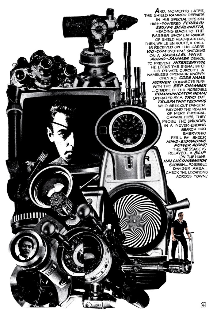
Nick Fury, Agent of S.H.I.E.L.D. #5
The impact of Jim Steranko’s iconic take on weird super-espionage would be felt for years. It has been a blatant inspiration for all sorts of comics since then, most notably Casanova, The Manhattan Projects, and The Invisibles. Warren Ellis, John Cassaday, and Laura Depuy did a neat homage to Steranko’s Nick Fury in Planetary #11.
All in all, this was a remarkable series, with groovy stories and brilliant art that spilled over onto some memorably trippy covers…
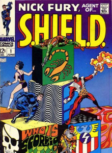
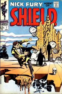
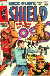
The third cover above is actually by Barry Smith, from an issue with no involvement by Jim Steranko (who left the series after Nick Fury, Agent of S.H.I.E.L.D. #5, except for a couple of covers, and went on to put his unmistakable stamp on Captain America)… Smith was one of a handful of artists with the ungrateful task of following Steranko yet who I think did a pretty swell job nonetheless.
Above all, the talented Frank Springer pulled out all the stops to craft issues worthy of Steranko’s colorful, dreamlike style. (He also drew a nice spoof of the magnificent Nick Fury, Agent of S.H.I.E.L.D. #3 for Marvel’s parody series Not Brand Echh #11.)
Check out this bombastic splash, by Springer:
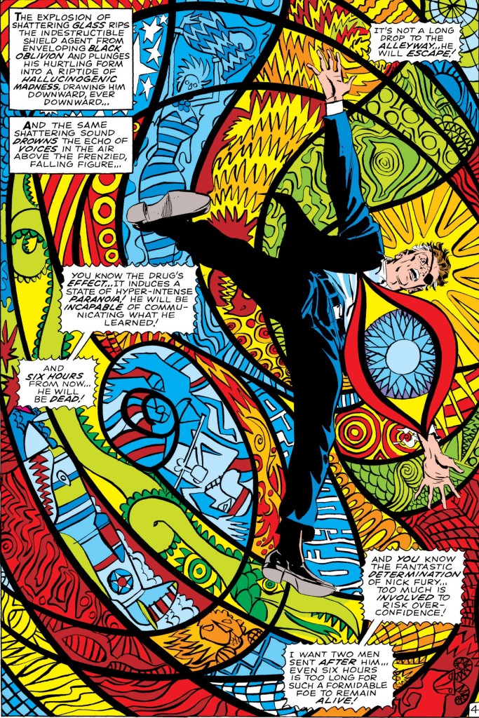
Nick Fury, Agent of S.H.I.E.L.D. #7
Talk about funky espionage!
