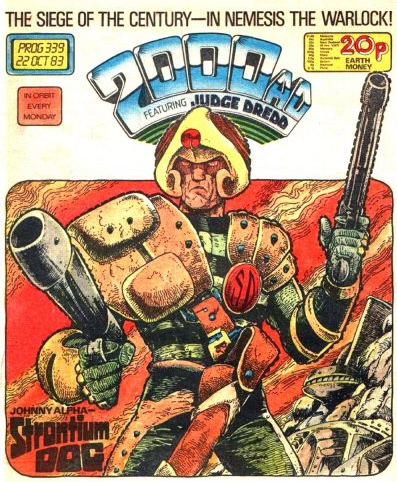
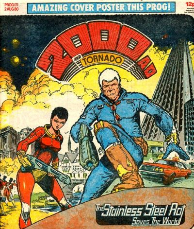
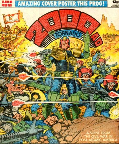
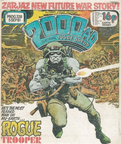
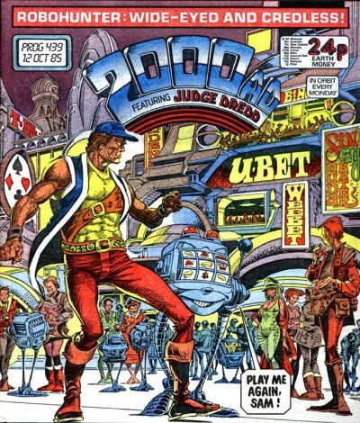
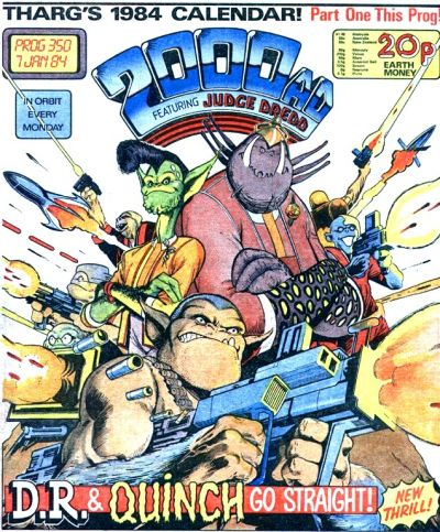
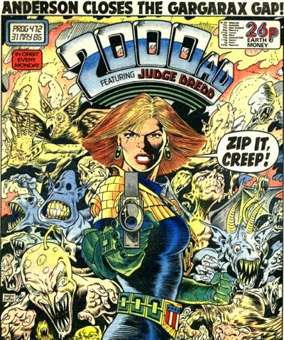
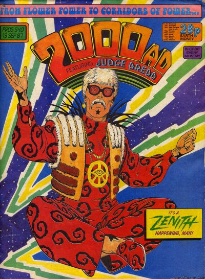
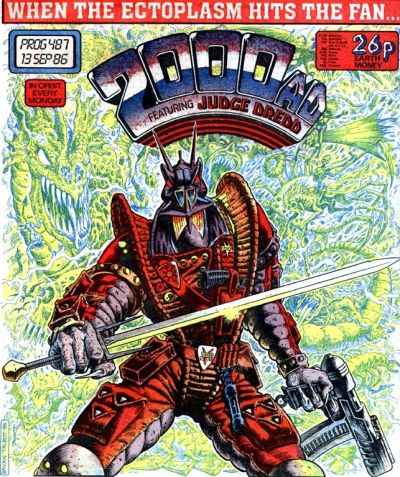
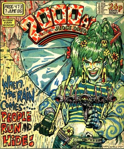
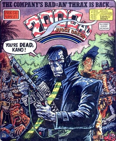
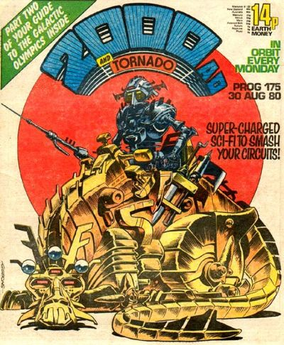
Since this year’s weekly reminders that comics can be awesome have been focusing on splash pages, double spreads, and short sequences of interior artwork, it’s been a while since I’ve highlighted covers, which are actually one of my favorite features of the whole medium, requiring artists to convey in a single image the exact tone readers should expect to find inside each issue.
Some of the greatest examples come from the British anthology 2000 AD, which has a very strong tradition of covers spotlighting its incredible character designs as well as a general sense of damned coolness (including, more often than not, hilariously huge guns). Here is a selection of a dozen classics from the series’ first decade or so:
