My post on Golden Age splashes a while back highlighted a great opening teaser page from Batman #50. In fact, that was only one of a handful of funky-looking pages in this (otherwise not exactly a classic) comic. So, for geekness’ sake, I figured today I’d draw attention to another five of them.
Dated December 1948–January 1949, Batman #50 was officially illustrated by Bob Kane (although according to the GCD he only drew the Batman & Robin figures, the rest of it was actually penciled by Lew Sayre Schwartz, and the whole thing was inked by Charles Paris). As was usual with the Batman series at the time, this issue contains three stories. The first one – ‘Lights- Camera- Crime!’ – features photographer Vicki Vale. In case you don’t know, Vicki Vale is the Batman comics’ equivalent of Lois Lane (except that there is no catchy song about her). Well, honestly, she’s more of a shameless copy of Lois, i.e. a nosy reporter and love interest out to expose her hero’s secret identity. In this story, Vicki’s editor assigns her with doing a series on various law enforcement groups, including on-the-spot pictures of lawmen cracking on criminals, which leads to this handsome page:
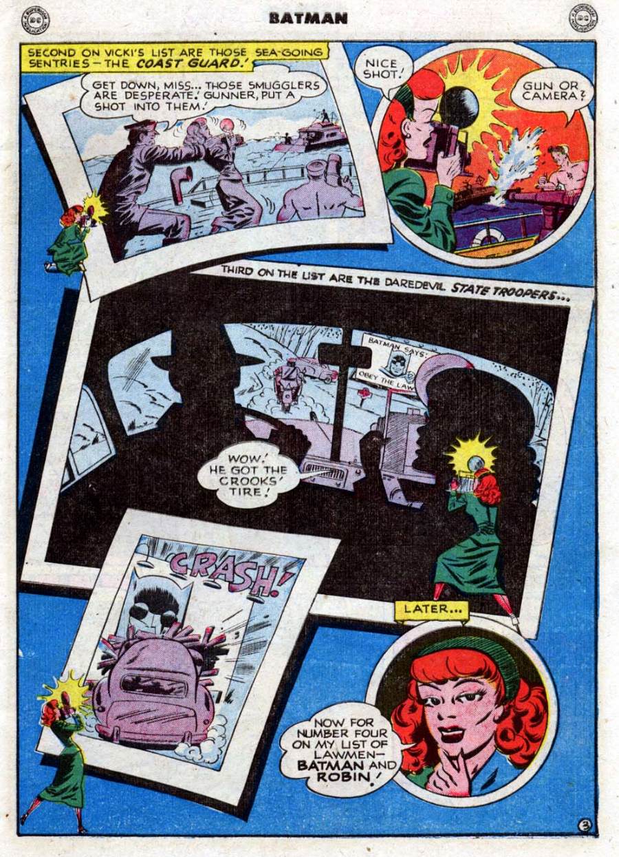 It really feels like a movie montage. Instead of a traditional comics grid, the panels – some of which framed like photos – flow across the page and lie on top of each other, and Vicki is all over the place (she shows up seven times), facing different directions. I also like the detail of the crooks’ car smashing against an Orwellian Batman billboard.
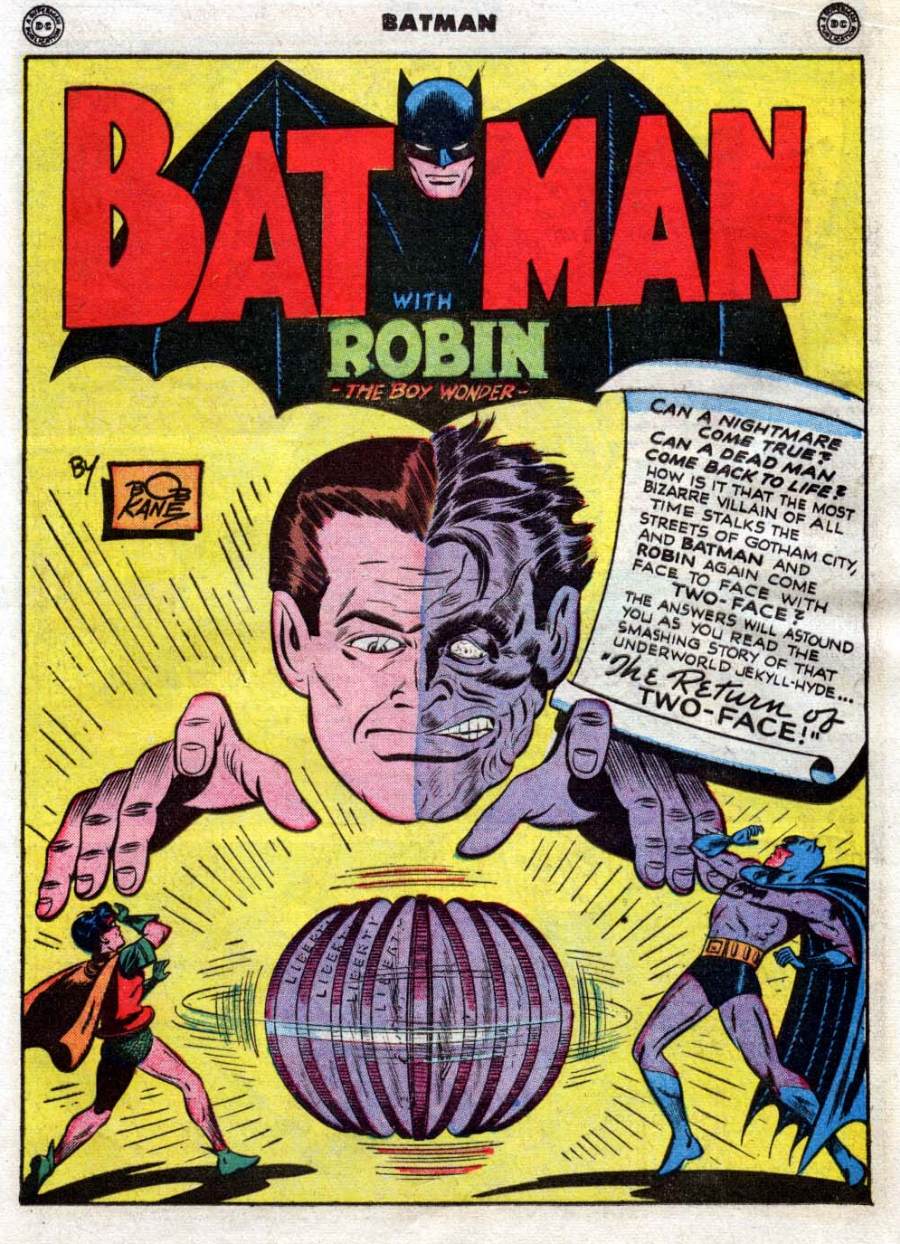 This beauty is the title splash for the second story, ‘The Return of Two-Face!’ It is so striking that it was also used for the issue’s cover, presumably due to its hypnotic potential. Notably, there is a neat symmetry (always suited for a Two-Face story) between the two sides of the page. On Harvey Dent’s right side (our left), everything is brighter: not only his face and hand, but Robin’s colorful clothes, Bob Kane’s orange signature box (which leaves more space for the yellow background)… even the spinning coin features the word ‘Liberty.’ On the other side, Two-Face’s darker skin is complemented by Batman’s comparatively darker outfit and a text box obscuring the background. This could be the cover to a Pink Floyd concept album that never happened!
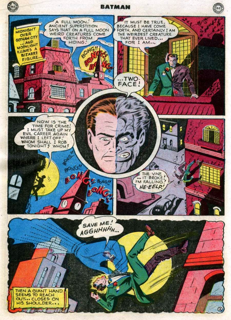 Again, Two-Face’s split features are at the center of a pretty symmetrical page, this time illustrating a Felliniesque dream sequence. Batman comics being as loony as they are, it may not be immediately clear that something is off, but that final panel with the squiggly borders – not to mention the huge, phantasmagorical hand – is an effective reveal.
Soon, the Dynamic Duo finds itself chasing Two-Face through a stadium, during a motorcycle race:
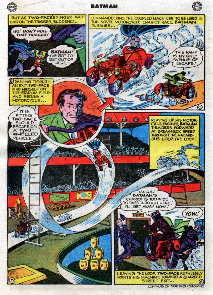 If the last page looked like the product of shrooms, this one is even trippier. It’s not just the massive spiral track where Batman chases Two-Face… the layout itself seems designed to make us dizzy with its non-linear reading order (helpfully clarified by the letters A to D in the panel corners, in case you get lost). What I don’t get is the guards’ surprised reaction – this is Gotham City, guys, by now you should be used to crazy stunts like this. Hell, this isn’t even the wackiest chase in the comic: 4 pages later Batman rides an elephant!
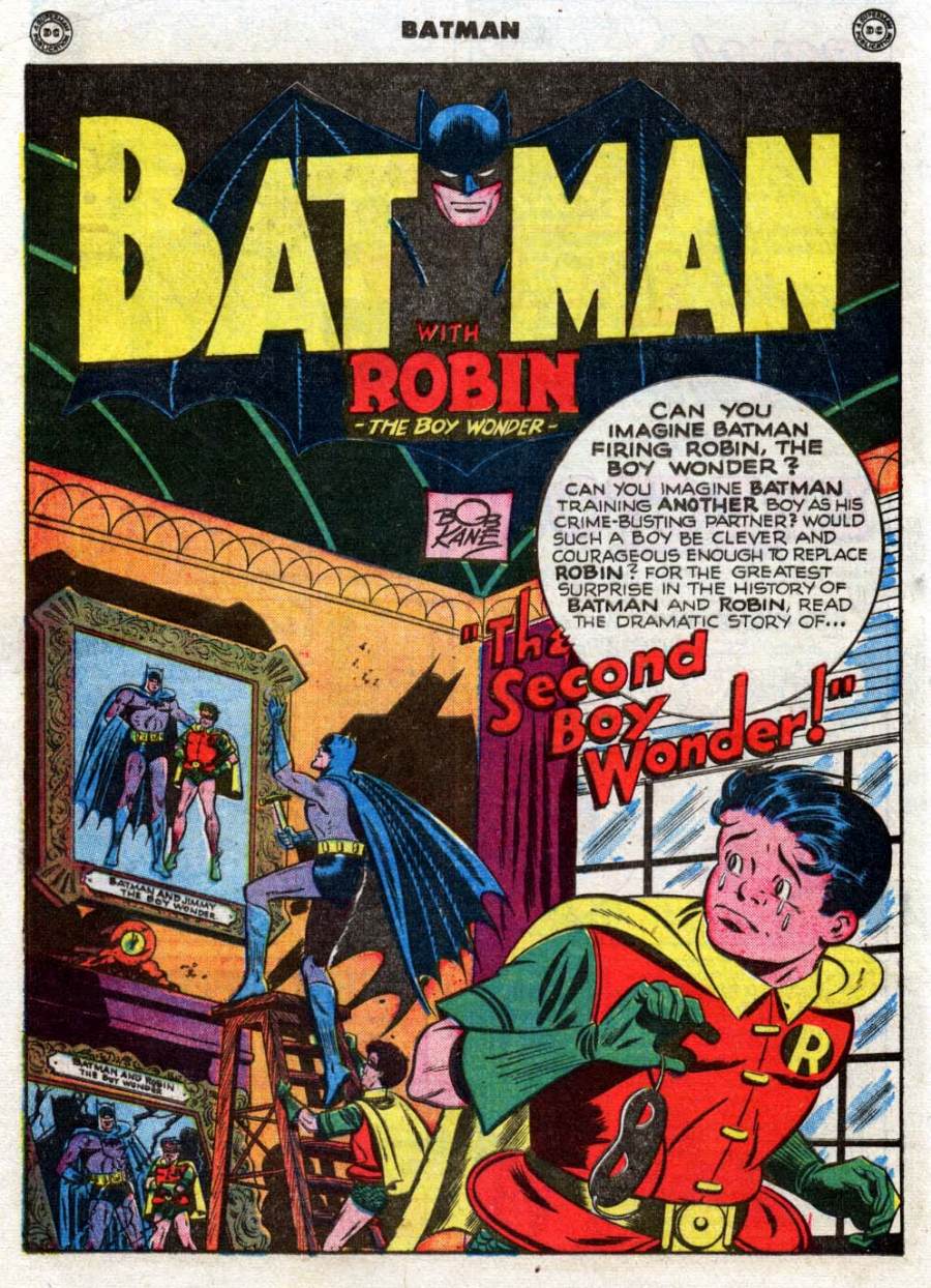 Finally, there is the splash page for the issue’s third story. From the Boy Wonder’s melodramatic tears to the kaleidoscopic effect of the four Robin suits, the whole image is a delight. The campiest aspect, though, is the fact that they’re clearly not in the Batcave (hence the window), which raises the question of why Batman would have a portrait of the Dynamic Duo on top of Wayne Manor’s fireplace… won’t guests get suspicious, Bruce?
