Neal Adams died last week. Years ago, I wrote briefly about his gothic artwork and his sensationalist Batman covers, but I can’t really overestimate Adams’ importance: he was arguably the greatest and the most influential artist in the history of Dark Knight comics (yep, up there with Bob Kane, who crafted Batman’s original design together with Bill Finger). The naturalistic way Adams drew the Caped Crusader – especially compared to the cartoonier aesthetics of previous incarnations – projected Batman’s humanity as well as a renewed sense of menace, imbuing the stories with a melodramatic level of emotional strength, which no doubt pushed the writers and editors themselves in that direction… Hell, the same goes for all kinds of heroes he reimagined, from Green Arrow to the X-Men!
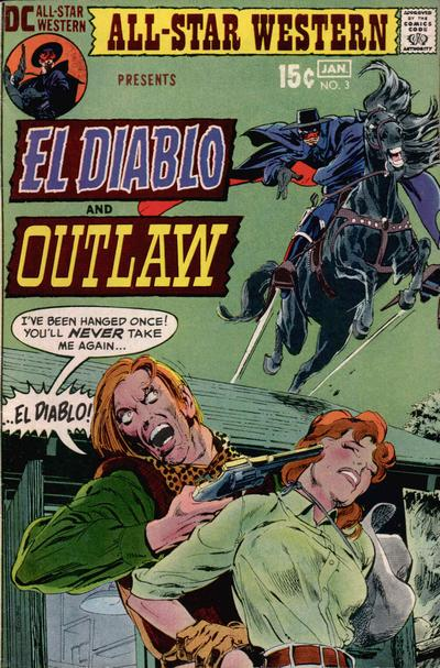
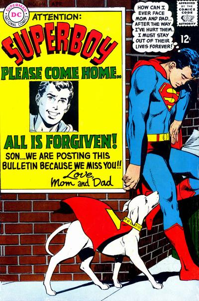
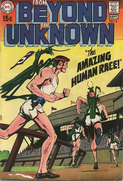
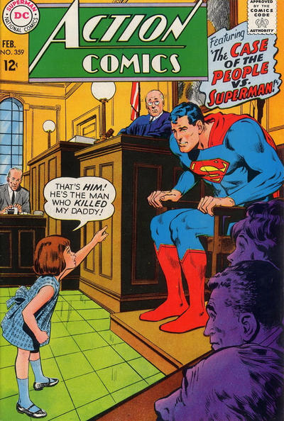
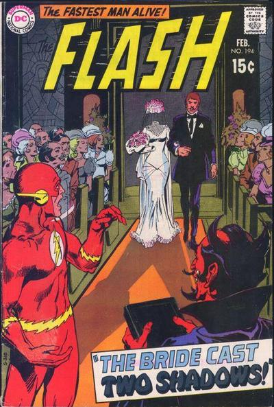
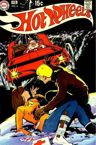
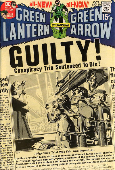
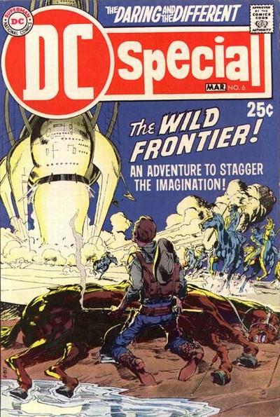
With that in mind, the passing of Neal Adams deserves some sort of special tribute in Gotham Calling. And since 2022’s weekly reminders that comics can be awesome are all about covers, this week I’m devoting a trio of posts to Adam’s talent for forceful cover images. His impeccable sense of design tends to draw your gaze across each layout in such a smooth way that the result is nothing short of dynamic, with triangular compositions making your eyes circle around while absorbing suggestive details (a hand gesture, a peripheral shadow, a reflection on a puddle) along the way… The result excels at thrills, pathos, and comedy, enhanced by the vivid facial acting, which ranges from subtle expressions to unabashed histrionics.
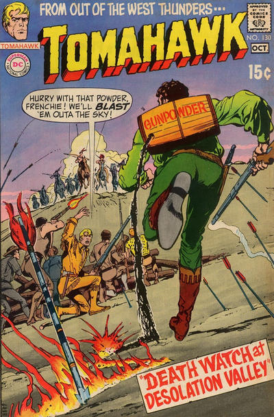
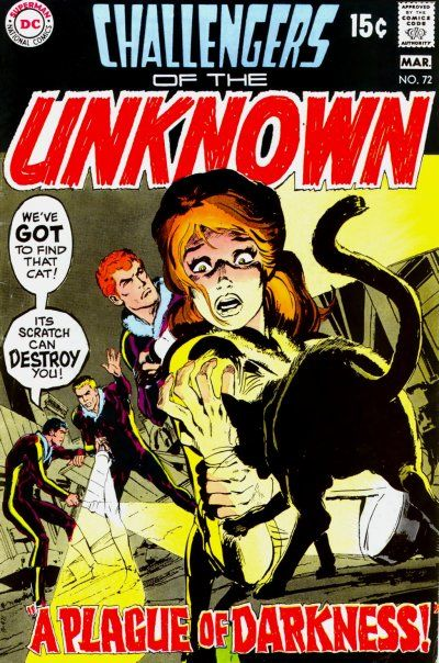
For today, I selected ten DC covers that showcase Neal Adams’ ability to condense a story’s entire premise in a single, evocative image. In the examples below, he does so through various techniques (even the recurring device of a court trial is framed through entirely distinct approaches), but I’d like to call your attention to two of them. One is the momentum contained not just in the way a cover can make you anticipate the future (like the Tomahawk one) or grasp the past (Challengers of the Unknown), but also sense movement contained in a specific moment (although they’re different men, the placement of the runners in From Beyond the Unknown allows us to visualize different stages of their race in one go). The other effective strategy concerns postures: the particular depictions of Superman bending forwards, the Flash turning around, or an armed cowboy looking up imply discomfort and vulnerability even among powerful figures, thus strongly conveying the promise of danger to be found inside the comics.
