Top 12 foreign-language film noirs

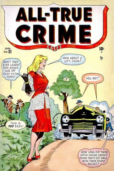
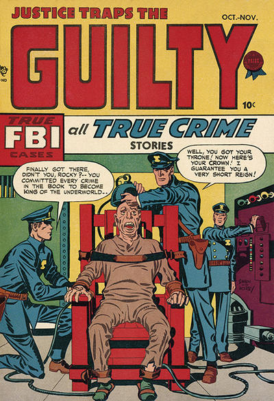
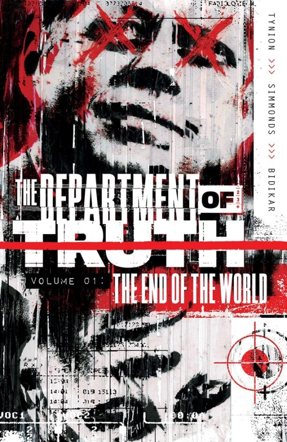
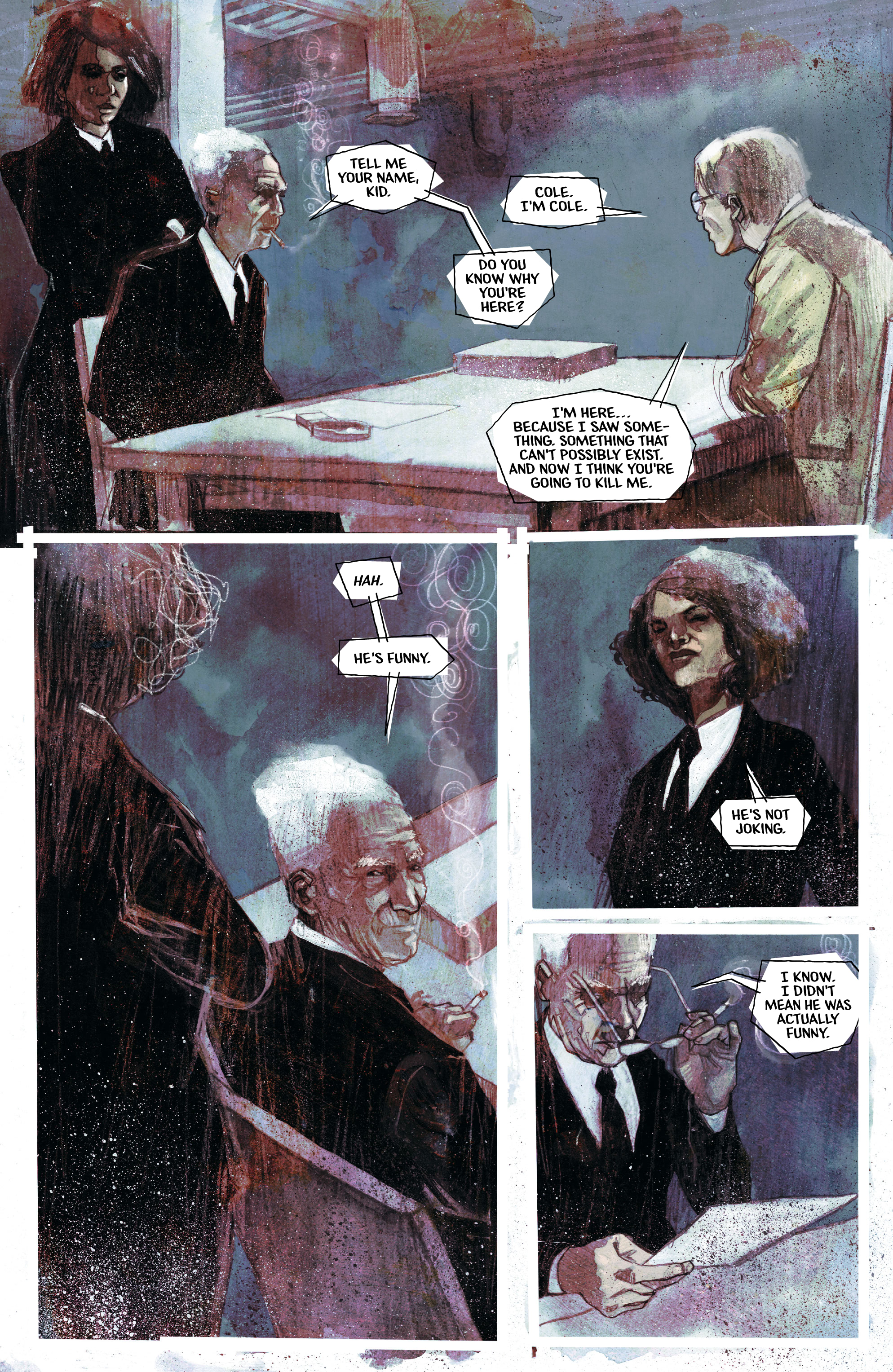
When I ranked my top 50 noir thrillers last month, I only included movies spoken in English. It was an easy way to curb the size of the list. However, this type of gritty, atmospheric crime stories has found an expression in different cultures, inspiring, for example, a ton of Eurocomics.

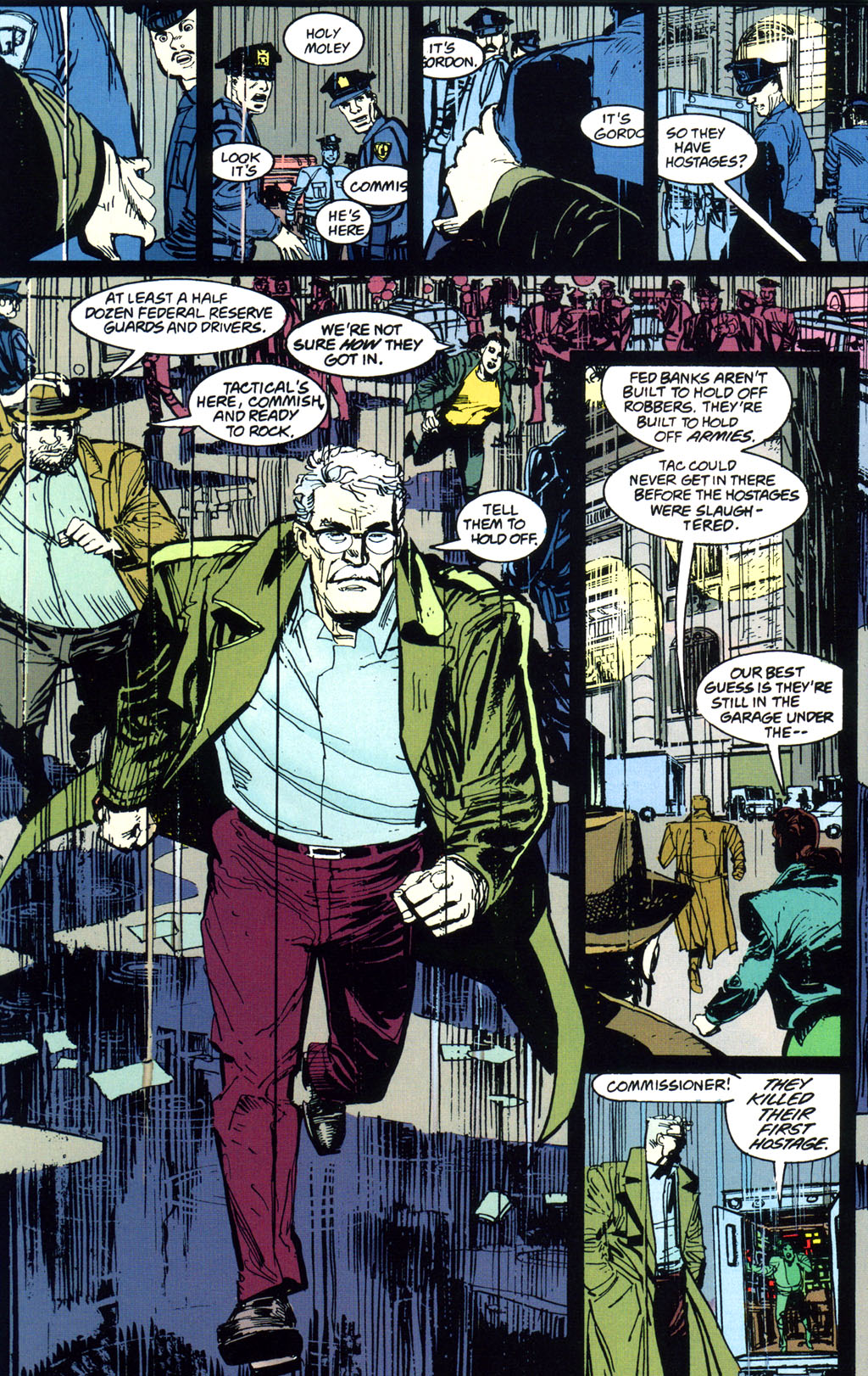
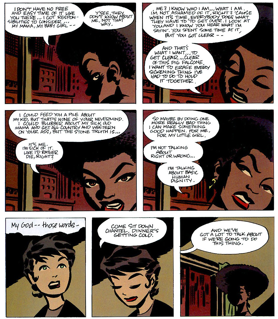
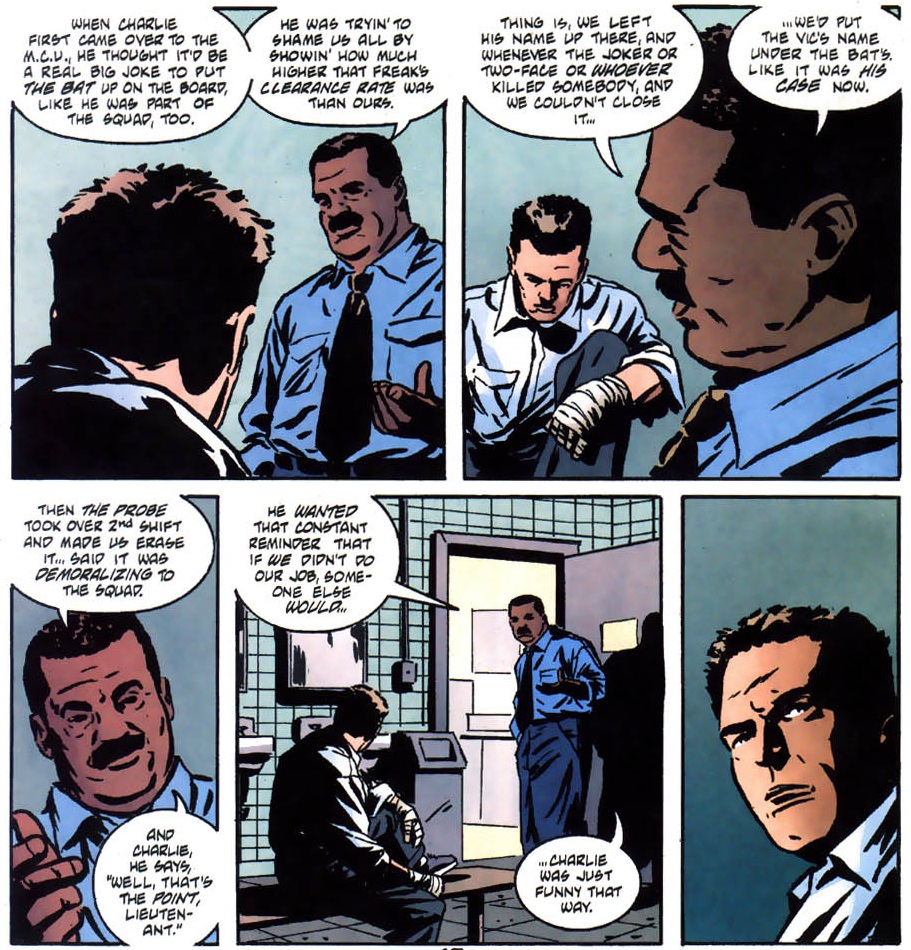
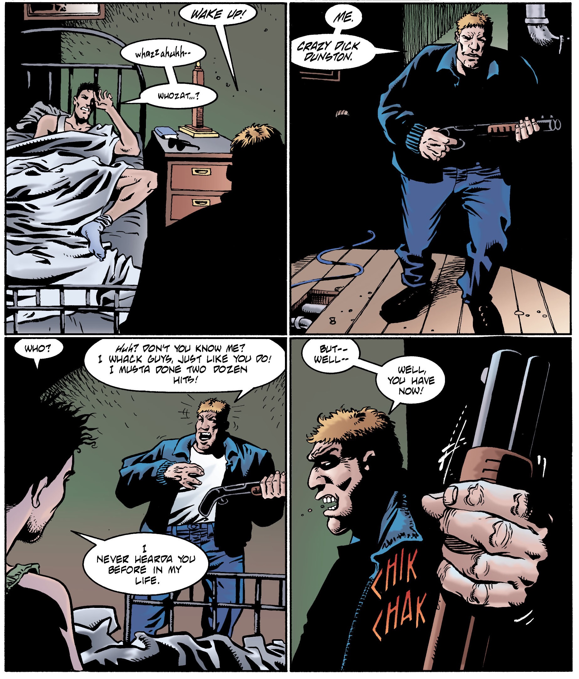
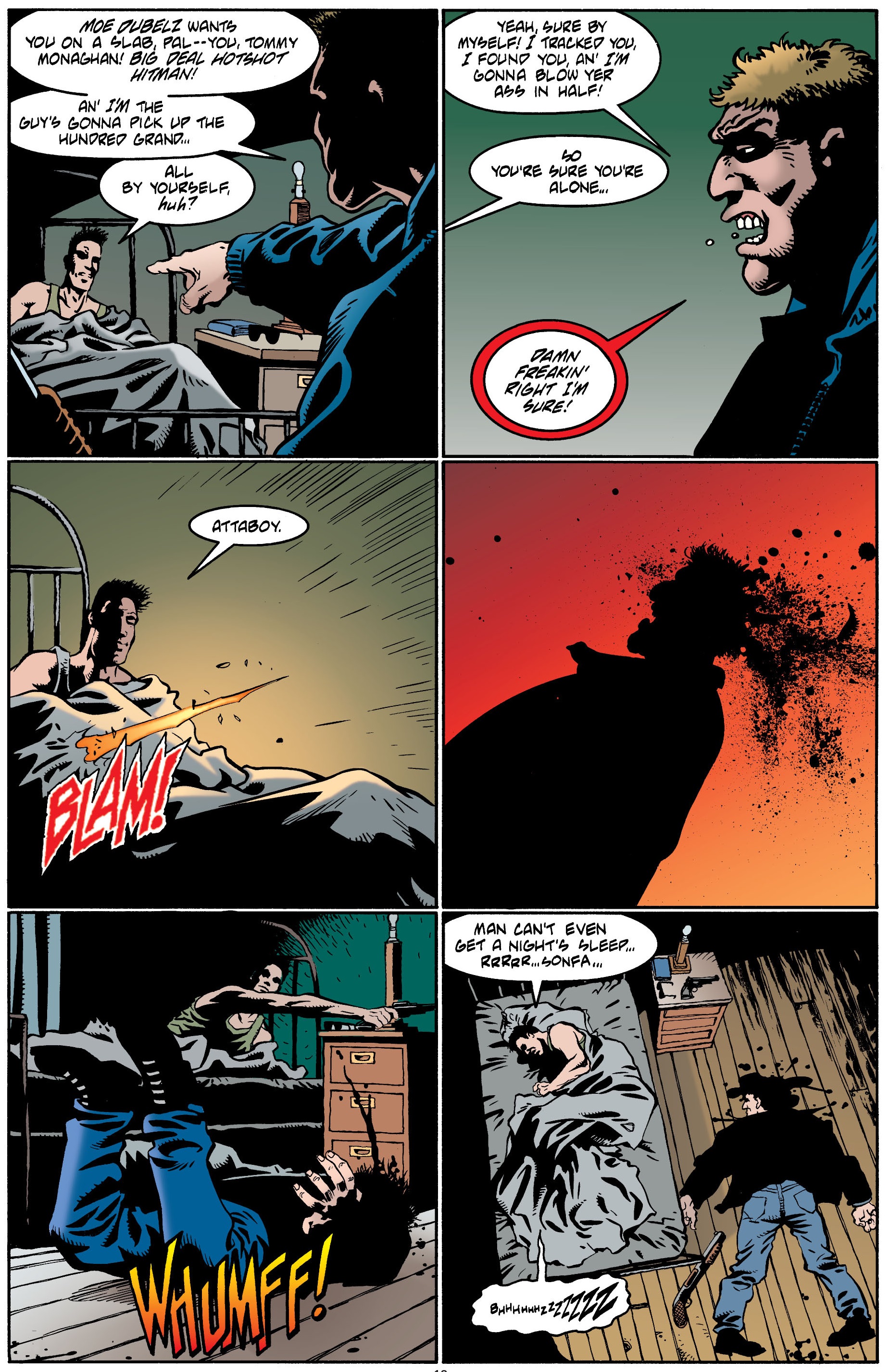
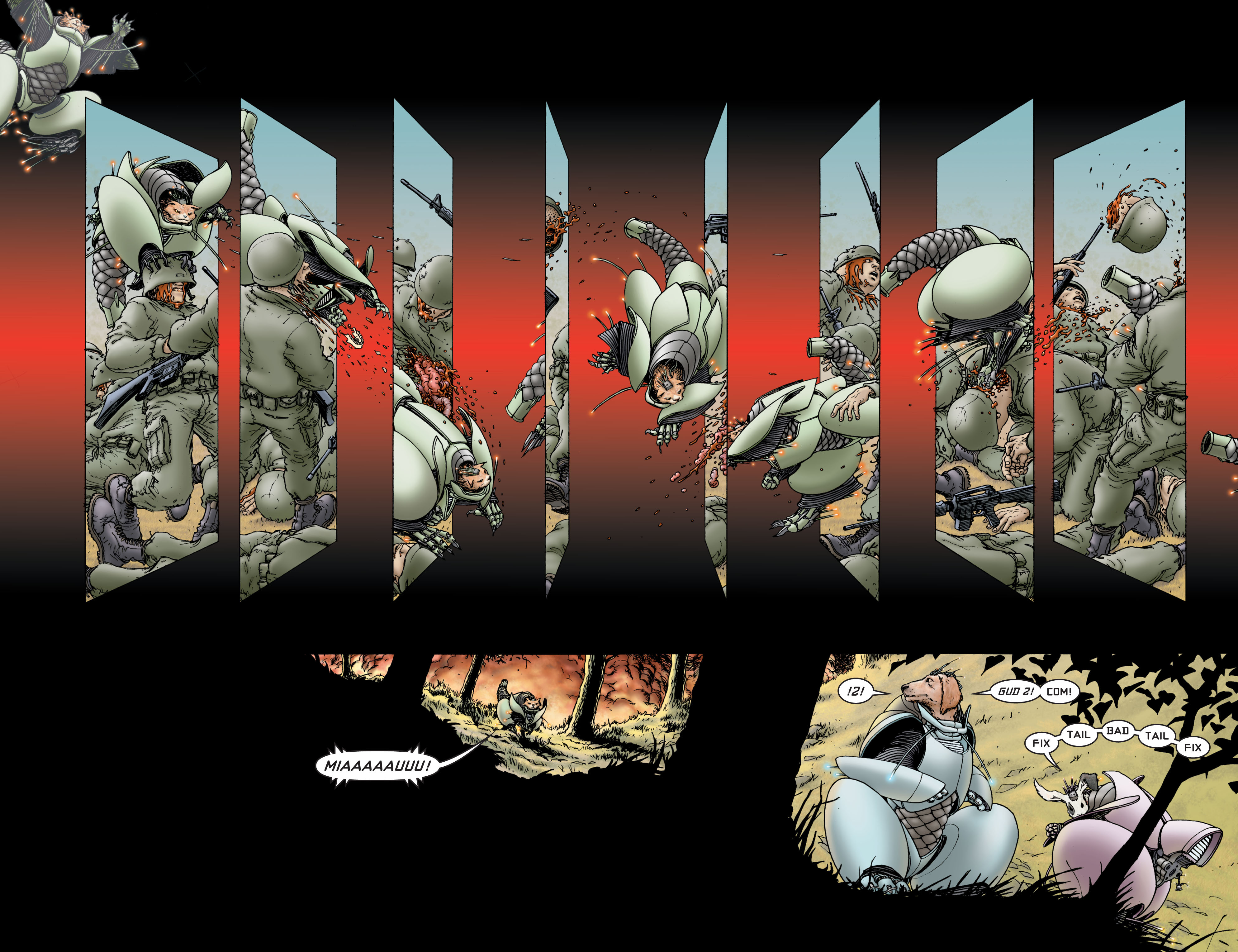
noir comicsLethal Lullaby: Telenko’s Heart

With this in mind, I’ve decided that it would also make sense to highlight a dozen foreign-language pictures that I highly recommend for anyone who is into film noir and interested in seeing how this awesome branch of cinema was reinvented throughout the globe, already at the time. Again, I’m sticking to the period from the mid-1940s to the late 1950s, when the world was still picking itself up from WWII and when this genre’s motifs could still be presented with a relatively straight face…

In hindsight, it’s not surprising this narrative and visual form found its way beyond Anglo-Saxon countries. Its elegance was cheap to reproduce even in places without a large-scale film industry and there is something almost universal about many of the themes. Hell, that sort of quasi-transcendence is also what makes noir movies so enduring that we can still enjoy them today (as long as you’re willing to put up with their old-fashioned gender dynamics). In fact, the appeal of trapped anti-heroes desperately trying to escape their situation or character types like the amateur criminal – which lead to stories where we find ourselves rooting for the underdog protagonist to outsmart the professionals, both of the underworld and of the long arm of the law – continue to inform recent works, from Breaking Bad and Ozark to Hannelore Cayre’s best-seller The Godmother.

To be sure, there is something more specific going on in each of the movies listed below. They use tropes like blackmail, backstabbing, cigarette smoke, tough guys, well-delineated silhouettes, and a brooding feeling of existential crisis to explore concrete historical contexts, from occupied Japan to General Franco’s dictatorship in Spain, making them all fascinating objects to discuss and analyze. And while the following list is based more on the noirness of the films’ tones and aesthetics than on their socio-political subtext, naturally there isn’t always a clear-cut distinction between the various layers…

riso amaro1. Bitter Rice (1949)

Film noir meets Italian neo-realism and a dozen other influences in this truly original, bewildering, and exciting masterpiece. It’s set in a rice plantation, of all places, where a fugitive hides a stolen diamond necklace and tries to mingle among the seasonal workers, even cynically mobilizing a bunch of illegals to struggle for jobs (thus protecting her cover). Like the story, the visuals mix the ugly reality of harsh working conditions – reflected in many of the faces – with sensationalist titillation, including plenty of curvaceous bodies (most notably the ravishing Silvana Mangano). Indeed, besides the pulpy fun of seeing the typical chases, gunfights, and double-crosses in such an atypical setting, Bitter Rice consistently delivers stirring sound and impressive images through an energetic direction that often goes for extended takes crowded with extras. With its socially conscious charge, you may think of it as a transatlantic relative of Jules Dassin’s Thieves’ Highway (which came out the same year), but this one provides a much more visceral and surprising experience, without the Hollywood polish.

wajda2. Ashes and Diamonds (1958)

The setting for this one is almost as unlikely: a war-torn Polish town, in the days immediately after the end of WWII, when the Home Army underground resistance was shifting its targets from the Nazis to the Reds. Despite the gloomy weight of war memories, there is an overwhelming sense of coolness to Ashes and Diamonds – not just because lead actor Zbigniew Cybulski appears to be channeling James Dean, but also because Andrzej Wajda’s camerawork keeps swinging around and finding the most potent angles, usually framing the action (or some arresting symbolic element) simultaneously in the foreground and background. Although this is a dark movie (I called Cybulsk the lead, but there are actually a number of subplots woven together, each of them imbued with the genre’s fatalism), it was made in a post-Stalinist context, with the filmmakers clearly having a blast with their commie-killing anti-heroes.

melville3. Bob le flambeur (1956)

The French loved film noir (hell, they coined the term), but no director went as far in terms of recreating it as Jean-Pierre Melville. Bob le flambeur (‘Bob the high-roller’) opens with an homage to The Naked City (again, by Jules Dassin), but instead of New York we get Paris – and instead of cops and crooks full of piss and vinegar we get aging men, wrapped in weariness and ennui, especially the titular gambler, willing to risk it all in a fateful one-last-job. The result is a sexy, languid, beautiful love letter to American gangster movies and heist thrillers, but also to a certain lineage of French lowlifes. Besides looking back, the film shaped the future of cinema as well, with Melville’s handheld camera shots of Parisian streets inspiring the movement that came be known as Nouvelle Vague. Plus, it boasts one of noir’s niftiest closing lines.

heist4. Rififi (1955)

Speaking of Jules Dassin: having been blacklisted in Hollywood, Dassin found a new home in Europe in the 1950s. This is his French – and very bleak – take on heist movies, which became as influential as John Huston’s The Asphalt Jungle and Stanley Kubrick’s The Killing. The silent robbery sequence, in particular, is one of the most memorable in this entire subgenre, up there with the one in Dassin’s Topkapi (although, unlike the neat Rififi, the rest of Topkapi is a cheesy comedy that’s practically unwatchable). Many critics see in this story of loyalty and the code of silence an allusion to Dassin’s own experience with HUAC back in the US, but, as pointed out by Ginette Vincendeau in the book European Film Noir, there is a domestic resonance as well, as Rififi’s gangsters ‘may be seen as a covert critique of a generation of men who compromised with the enemy during the war and betrayed the younger generation,’ inscribing the film in a whole cycle of 1950s’ French movies focused on underground societies, torture, imprisonment, and other potential metaphors for the recent Nazi occupation.

film noir5. Death of a Cyclist (1955)

A couple of illicit lovers accidentally run over a cyclist with their car and, sure enough, they soon find themselves in a Hitchcockian spiral of tension and paranoia. Like many of the great noirs, the premise of this Spanish thriller is relatively simple, but the increasing suspense, tight editing, sharp dialogue, and moral doubt give it a powerful, mesmerizing allure. Moreover, the film taunts Madrid’s censors with small jabs at the hypocrisy of the ruling class and at the USA’s complicity with the Franco regime. Rob Stone wrote a compelling analysis of the movie in European Film Noir, arguing that, since the protagonist is a product of Francoism, his crisis of masculinity can be read as undermining the hegemony of the regime’s patriarchal pillars, namely the church and the military, ‘both exclusively male organisations which have rendered Francoist Spain in their own likeness.’

noir6. Elevator to the Gallows (1958)

A killer stuck in an elevator. A young couple on the run. A desperate lover. A jazzy soundtrack. The occasional voice-over. Tragic coincidences. A maze-like plot. Neons in the night. A smoke-filled police interrogation. Industrial espionage. And, lingering above all, the ghosts from the colonial wars in Indochina (recently over) and Algeria (still ongoing) haunting French society…

kurosawa7. Stray Dog (1949)

A rookie Homicide cop loses his gun and has to dig deep into Japan‘s broken society to get it back. An early example of Akira Kurosawa’s amazing ability to fuse western cinema traditions with Japanese themes, Stray Dog was shot largely on location, giving us a raw, semi-documentary look into postwar Tokyo (complete with a voice-of-god narration) on top of being a twisty police procedural.

peter lorre8. The Lost One (1951)

One of the main figures of American film noir, exiled Hungarian actor Peter Lorre, returned to Europe to direct, co-write, and star in this West German psychological drama about Dr Rothe, a doctor at a refugee camp who, upon encountering his former assistant (now a war criminal on the run), has a series of flashbacks about his life as a scientist during wartime, when he became a murderer. A somber mood piece which, according to Tim Bergfelder, ‘invites the viewer to compare and judge different forms of killing alongside each other – Rothe’s ‘private’ homicides; the Nazis’ use of torture and murder; and the random war casualties encountered on battlefields and in bombing raids.’ The movie even uses trains as site and instrument of murder, drawing on one of the ultimate symbols of efficient genocide. That said, along with Vaclav Vich’s expressionistic cinematography, Franz Schroedter’s claustrophobic set designs, and Lorre’s assured direction, it’s the latter’s screen presence that turns The Lost One into such a haunting experience: his spooky eyes, the unsettling voice, the peculiar way he smokes, the blocky shape of his body as he walks, the intertextual echo of Fritz Lang’s M… No wonder he inspired a whole punk jazz concept album.

clouzot9. Jenny Lamour (1947)

One of my all-time favorite directors, Henri-Georges Clouzot, did this nasty, lurid French flick about the titular theater performer and her jealous husband, who get caught in a web of murder. At first, you may think the film noir style isn’t particularly pronounced, but soon the high-contrast lighting takes over and, if anything, the themes are even darker than in most entries on this list… The result is a cinematic tour-de-force, nonchalantly suffocating viewers with a tightening knot while taking them on a cold winter journey through the worlds of popular music halls, the pornography business, and seedy police stations, populated to bursting point by captivating, believable characters. In particular, the Maigret-ish Inspector Antoine steals the show as soon as he enters the picture (a veteran from the Foreign Legion, he is yet another reminder of France’s colonial dimension).

kurosawa10. Drunken Angel (1948)

More Kurosawa! The story of a difficult relationship between an alcoholic doctor and a young gangster with tuberculosis, set in Tokyo’s slums. Plot-wise, this tragic character study is more of a straightforward drama than the genre-shaped Stray Dog, but Drunken Angel’s overall mood is even more noirish. (Plus, there are more symbolic water puddles here than in Batman: The Killing Joke…)

film noir11. I Am Waiting (1957)

Kurosawa wasn’t the only one to bring film noir to Japan. I Am Waiting (which also opens with a puddle, perhaps as a nod to Drunken Angel) is a close relative of all those old-school potboilers about doomed lovers, violent memories, and ex-boxers fallen from grace, weaving a stylish, melancholic tale with enough flashbacks, broken dreams, and ironic twists of fate to satisfy any genre fan.

noir12. Don’t Ever Open That Door (1952)

An Argentinian adaptation of a couple of unconnected Cornell Woolrich short stories, each of them elegantly shot and acted, with a few melodramatic moments balanced by a very slick pace and mise-en-scène. The first story is a classic noir tale of revenge and vigilante justice, but the second one takes the prize, with a bank robber hiding out at his mother’s place, only to find himself in a proto-Don’t Breathe scenario. The whole thing feels a bit surface-level, but I can’t complain too much… Even the anthology format works out fine, making the movie resemble a live-action South American version of EC’s Crime SuspenStories. (By the way, the shadowy look and cynical edge are so spot-on that I wouldn’t be surprised if comic creators José Muñoz and Carlos Trillo watched this one when they were kids!)

Posted in HARDBOILED CRIME | Tagged , , , , | Leave a comment

COMICS CAN BE AWESOME (18 October 2021)

Your reminder that comics can be awesome, mummies edition:

the mummyjack kirbyeros


Posted in ART OF HORROR COMICS | Tagged , , , , , , , , , , , | Leave a comment

6 quirky Batmobile designs by Kelley Jones

Last week, I wrote about Norm Breyfogle’s knack for constantly coming up with new designs for the Batmobile, suggesting that the Dark Knight had an extensive car collection with vehicles of various shapes and sizes. Given the way Kelley Jones’ illustrations drew inspiration from different periods (Jones’ Gotham City tends to resemble a retro-futuristic version Dr. Caligari’s Holstenwall) and his flair for equipping Batman with ultra-elaborate gadgets, it’s not surprising that he too had a stab at a number of eccentric models of the Batmobile (especially in his Elseworlds tales).

Here are six cool designs from Kelley Jones’ comics:

batmobileRed Rain
batmobileGotham After Midnight #1
batmobileBatman #516
 batmobileBatman #527
batmobileHaunted Gotham #1
 batmobileGotham After Midnight #9
Posted in ART OF BATMAN COMICS | Tagged , | Leave a comment

COMICS CAN BE AWESOME (11 October 2021)

Since last week I spotlighted Dracula, let’s now turn to the second-best monster in popular culture… There are various memorable film takes on Frankenstein, from the classy Universal and Hammer series all the way down to Jess Franco’s sleazy – and utterly bizarre – The Erotic Rites of Frankenstein, but leave it to comics to keep finding awesome new approaches to the concept:

dick brieferfrankensteinJ.G. Jones


Posted in ART OF HORROR COMICS | Tagged , , , , , , | Leave a comment

Norm Breyfogle’s fluid Batman

 norm breyfogle

To say that Norm Breyfogle is my favorite Batman artist doesn’t do Breyfogle justice – along with Marshall Rogers’, his artwork is my platonic ideal of what a Batman comic looks like. It’s the first visual that comes to mind whenever I think of the Dark Knight and Gotham City (yes, before Neal Adams’ muscular naturalism or Bruce Timm’s angular style or even Jim Aparo’s increasing minimalism). Every time I write in this blog that a Batman comic looks stiff or ugly or realistic or whatever, you can assume that I always mean, implicitly, ‘compared to the comics drawn by Norm Breyfogle.’

With that in mind, this week I’ll try to break down exactly what makes Norm Breyfogle’s drawings so memorable. Part of the reason has to do with timing, of course, as Breyfogle regularly drew the Caped Crusader between 1987 and 1995, which is one of my favorite eras of the franchise in terms of stories, so it’s not surprising his images left such a strong impression on me (he also worked on a few Batman-related special projects until 2014, when he suffered a debilitating stroke). Yet a lot of it, I’d argue, has to do specifically with Breyfogle’s own artistry…

 Dynamic DuoDetective Comics #579

It’s not hard to see why DC first decided to assign the 26-year-old Norm Breyfogle the gig of illustrating one of their core books, Detective Comics. At the time, Breyfogle was drawing and lettering Steven Grant’s Whisper, a cocktail of ninjas, yakuza crime lords, and shadowy government conspiracies, mostly set in the gritty streets of New York (i.e. the most ‘80s comic of the eighties, just as Miracle Mile is the most ‘80s movie of the eighties), so it wasn’t a big jump to Gotham City. After all, Batman has traditionally benefitted from the fact that the superhero genre lends itself quite well to crosspollination with street-level crime fiction (a fact that Netflix went on to further prove through their excellent live-action series Daredevil and Luke Cage) and Breyfogle seemed right at home in this intersection.

Besides instilling Gotham with suitably seedy aesthetics, Norm Breyfogle could pull off blistering action scenes like few in the business, his pencils – which he gracefully inked himself – oozing a particular sort of fluidity… In fact, two sorts of fluidity. First of all, his characters (especially the Dynamic Duo, as you can see above) displayed incredibly fluid movements, their fights an acrobatic choreography not unlike a violent type of ballet. One of my issues with Batman’s live-action adaptations is precisely how static the Caped Crusader tends to look on the screen, in contrast to the elegance and vitality of Breyfogle’s version, who never misses an opportunity to engage in circus-worthy pirouettes:

breyfogleBatman #462

Yet the fluidity doesn’t apply just to the cast’s sweeping sense of movement, but also to the whole reading experience. Whether you’re following Batman’s moves or perhaps peeking into somebody else’s conversation, your eyes just flow through every page, flying to the end of each issue. Norm Breyfogle’s sharp, mostly diagonal lines expertly direct the readers’ pace and gaze, often in a speedy zigzag motion, making his comics feel like a dizzying shot of adrenaline. I know they’re still, but the images appear to slide in every direction, even sometimes advancing towards us as if trying to rub their intensity in our faces.

The ensuing dynamism – along with Breyfogle’s emotion-heavy facial expressions – made for a happy match with Alan Grant’s scripts, which were full of over-the-top action and sensationalist set pieces…

 Black SpiderShadow of the Bat #5

Indeed, Norm Breyfogle’s early collaborations with Alan Grant (no relation to Steven) – first in their Detective Comics run and then in Batman and Shadow of the Bat – had a punk-ish mix of grittiness and lunacy akin to that of a lot of cult cinema from this era, like Russel Mulcahy’s Highlander, Dan O’Bannon’s Return of the Living Dead, and Alex Cox’s Repo Man (I could easily imagine Breyfogle & Grant adapting any of these to comics!). Their Gotham was a nocturnal carnival of graffiti-sprayed derelict buildings bursting with delinquent youth gangs and homeless people, no doubt enwrapped in the stench of littered garbage and the sweat of desperate junkies. Hell, you can practically hear Bad Religion’s ‘In the Night’ blasting on the soundtrack (or Cameron Howe’s playlists from Halt and Catch Fire, for that matter).

Breyfogle was such a master of layouts that he even dared experiment with exuberant gimmicks, like in this page where the Dark Knight lends his shape to the panel borders:

Dark KnightBatman #458

Norm Breyfogle’s stupendous flair for composition was seen in his covers as well. I particularly like the ones in which Breyfogle spotlighted the issues’ villains while treating the Caped Crusader as this eerie looming presence (thus capturing the rogues’ inner perspective), conveyed through shadows and silhouettes:

killer croc     Scarface     catwoman

Probably a good way to understand the level of dedication and consideration Norm Breyfogle put into his Batman work, effectively channeling his outstanding talent into a commercial assignment for a lowbrow corner of popular culture, can be found in a passionate letter he wrote to The Comics Journal, in 1988, defending Steven Grant against Gary Groth’s narrow definition of what – and whom – should be considered artistic: ‘Are [Frank] Miller and [Alan] Moore “artists” only because they push present limits? No. Their work is meaningful or beautiful as well. One can be meaningful or beautiful within almost any limits, in fact, all Art and all life exists within limits. (It’s always amused and frustrated me how the world of “modern” fine art fails to understand this fully.) The impressionists’ work is forever beautiful, in my mind forever Art, but they were originally considered iconoclasts and are now old hat! Surely this alone doesn’t make a present-day impressionist a non-artist! If one is overtly concerned with the present definition of “Art” one cannot create.’ He concluded that ‘all Art depends on both sophistication and naivite.’

The belief that artistic value could find a place even in a formulaic franchise shines through in the way Breyfogle approached each cover or page as a single piece, to the point where it’s hard to detach one panel or detail from the rest (believe me, I’ve tried, for this blog, and his images put up a bigger fight than those of most other Batman artists when it comes to singling out specific bits). As a result, it is a joy to study many of his pages, appreciating how he carefully crafted them as a fluid whole.

This is especially true of Norm Breyfogle’s painted art on the superb graphic novel Birth of the Demon (which remains the best version of Ra’s al Ghul’s origin story), but you can still see it in some of his later work…

norm breyfogleAnarky #3

(Yes, the digital coloring doesn’t suit Breyfogle’s smooth pencils so neatly…)

The page above is from a series starring the Gotham City vigilante Anarky, which Norm Breyfogle co-created with Alan Grant back in 1989. That character has one of Breyfogle’s most remarkable designs – his look has traces of the protagonist from Alan Moore’s and David Lloyd’s brilliant V for Vendetta (thus visually translating that comic’s obvious inspiration for the creation of the whole Anarky concept), yet you could tell from the start that there was something peculiar about the way he moved…

AnarkyDetective Comics #609

And, sure enough, it was soon revealed that the costume disguised the vigilante’s identity beyond hiding his face. It was actually an elaborate contraption that misled witnesses – and the initial readers – about the character’s whole physiognomy, thus creating a clever red herring before the revelation at the end of Anarky’s introductory arc, which made the unmasking much more impactful:

norm breyfogleDetective Comics #609

Besides Anarky, Norm Breyfogle designed several other recurring villains, such as the Ratcatcher, the Corrosive Man, Mortimer Kadaver, Victor Zsasz, and Amygdala. My favorite ones actually made their debut quite early on, namely the Ventriloquist and his puppet, Scarface, both of which stood out as soon as they showed up…  although, to be fair, puppets are inherently creepy as a rule anyway (that said, as far as comic puppets go, nothing beats The Vault of Horror’s short story ‘Strung Along’).

On top of all of these original designs, Breyfogle also got to put his spin on pre-existing characters, often making them more elongated, flexible, and expressive than usual – including the Dark Knight himself, who looked much more emotionally versatile in these comics. Here is Breyfogle having a go at many of the classic members of Batman’s Rogues’ Gallery:

breyfogleDetective Comics #606

Finally – and speaking of redesigning old concepts – I have to mention Norm Breyfogle’s idiosyncratic approach to the Batmobile, which he kept reinventing every few issues.

He started out with a variation of the Lincoln Futura from the 1966 TV show, which had a brief revival in the mid-1980s….

batmobileDetective Comics #584

(Here is Klaus Janson’s version, in case you want to compare.)

…and he soon went on to introduce a number of new versions, each of them more futuristic-looking than the last:

batmanDetective Comics #589
batmobileDetective Comics #591
batmanDetective Comics #601

The apparent reasoning behind this was that, at the end of the day, Bruce Wayne was a rich guy who was into gadgets, so he was bound to have a large car collection. Plus, he probably crashed the Batmobile all the time, what with all those death-defying chases…

Cars can be an efficient way to convey their owner’s characterization and Norm Breyfogle’s slick, ever-changing Batmobiles did just that in a fun and relatively subtle way. Perhaps he was inspired by Jack Kirby, who also tended to use strange machinery to reveal aspects of the cast in his work, although the King of Comics was less subtle about it. For instance, you can tell the guy below is up to no good just because even his car looks so damn evil!

jack kirby2001: A Space Odyssey #9

Ultimately, the string of vehicles demonstrated Batman’s – and Breyfogle’s – restlessness and perfectionism, constantly searching for new aerodynamic forms to suit the larger purpose of making crime-fighting looking freaking cool.

BatmobileBatman #474


Posted in ART OF BATMAN COMICS | Tagged , , , , , | 2 Comments

COMICS CAN BE AWESOME (4 October 2021)

A reminder that comic book covers can be awesome, Dracula edition:

DraculaMike Vosburgvampire


Posted in ART OF HORROR COMICS | Tagged , , , , , , , , , , , | Leave a comment

On Dynamite’s James Bond – part 2

If you read last week’s post, you know I’ve been looking back at the James Bond comics published by Dynamite in these last few years.

By securing some of the industry’s top talent, this publisher has been able to churn out a fair amount of cool one-shots and mini-series without devaluing the brand too much. Among my favorites were Ibrahim Moustafa’s darkly comedic Solstice and Ales Kot’s typically conceptual The Body. Powerfully drawn by a host of angular artists (Luca Casalanguida, Antonio Fuso, Rapha Lobosco, Eoin Marron, Hayden Sherman), the latter six-issue series was a quasi-anthology of loosely connected Bond stories delving into different aspects of the character, titled ‘The Body,’ ‘The Brain,’ ‘The Gut,’ ‘The Heart,’ ‘The Lungs,’ and ‘The Burial’ (each of them both literal and metaphoric terms, of course). I’m usually annoyed by Kot’s keenness to show off his cleverness and I think 007 – much like the Punisher – is one of those characters that generally works best the less seriously you psychoanalyze him, but here, as a one-off project deconstructing Bond, the result was pretty satisfying!

077The Body #6

Bond’s world and cast have become more developed as well. For instance, second-string CIA agent Felix Leiter got his own moody spinoff – written by James Robinson and illustrated by Aaron Campbell, with beautiful colors by Salvatore Aiala – which guest-starred one of my favorite supporting characters, ‘Tiger’ Tanaka, the over-the-top Japanese version of James Bond (from You Only Live Twice). I also quite enjoyed Greg Pak’s run on James Bond 007, a nifty spin on Goldfinger that, among other things, introduced a fun, revamped take on the Korean Oddjob – one that actually provided some respectful characterization for what used to be little more than a racialized henchman with a goofy gimmick. (Pak then wrote a brief sequel in Reflections of Death.)

007 comic bookFelix Leiter #5

Not all projects tied directly into this new continuity. There was a 12-part James Bond Origin series set in World War II, but not even Jeff Parker – whose writing I usually adore – could get me to care about a James Bond Bildungsroman… If you really want to see Parker do his magic with a super-spy series, then you’ll have a much better time with his current Valiant ongoing Ninjak, which on top of everything else benefits from Javier Pulido’s incredibly neat artwork:

javier pulidoNinjak (v4) #1

(Yep, that’s Ninjak saving a version of Jamal Khashoggi, because comics.)

Meanwhile, back at Dynamite, Van Jensen has been faithfully adapting Ian Fleming’s original novels to comics…

james bond graphic novel          077 graphic novel

(Thank you for the gorgeous painted covers, Fay Dalton!)

This comic book version of Casino Royale, stylishly illustrated by Dennis Calero, is almost as strong as Darwyn Cooke’s adaptations of the Parker books, likewise capturing the original’s hardboiled flavor while using visual language to represent the protagonist’s cold professionalism. Just like in the awesome 2006 film adaptation everything about Daniel Craig’s performance – from the way he moves and fights to the way he smirks and bluffs – conveys how much of a blunt instrument Bond is, so do the creators here use comics’ potential to economically capture the character’s hyper-focused psychology… not to mention Ian Fleming’s infatuation with tiny descriptive details:

007 comicCasino Royale

(As you can see, letterer Simon Bowland is in top form as well.)

Casino Royale’s plot hinges a lot on card games, which is the kind of device that translates fairly well into a visual medium like comics. Gambling, in fact, becomes a major thematic metaphor in the story, unlike in later James Bond adventures, where it’s typically used as just a glamorous gimmick for quick characterization… Yes, luck is an important factor, but you can conveniently establish a character’s ingenuity by having him figure out how someone else is cheating. This is also a recurring trope, for instance, in the franchises starring the blind swordsman Zatoichi or the illusionist gunslinger Sartana (and in many other westerns, really), whose anti-heroes – like Bond – aren’t above cheating themselves. (The highly entertaining Samaritan Zatoichi even has a scene where the protagonist is caught using the same trick he had often exposed in earlier movies!)

Dennis Calero and colorist Chris O’Halloran form quite a duo. They strike a smooth balance between realism and the occasional experimental touches, pushing the latter particularly far during the story’s infamous genital torture scene, to great effect. Meanwhile, the sexist prose gains from the degree of removal provided by the art, which makes it feel as if we are seeing Bond’s misogyny from the outside (even when we share his point of view, like in the page below), especially as Calero’s rendition of Vesper Lynd plays down the exploitative angle.

077James BondCasino Royale

Sadly, artist Kewber Baal and colorist Shimerys Baal failed to meet the same bar in Van Jensen’s second book, Live and Let Die. Their storytelling is way too pedestrian for this sort of material… Kewber Baal’s artwork was fine in the cheeky, lighthearted chapter he drew for Refections of Death, but here such a straightforward approach fails to create the kind of sensorial distance that could help modern readers cope with the most sexist and racist elements of Fleming’s text by framing them in a stylized version of the past. It doesn’t help that Jensen’s script is much more text-heavy this time around, delivering an awkward adaptation that tries to preserve too much of the original without taking full advantage of the new medium… I cannot honestly recommend it.

You might as well watch 1973’s Live and Let Die movie, un-PC as it is, since at least it contains some fun elements of blaxploitation – a film subgenre that actually found its way into a number of that era’s spy products, from the anti-Bond The Spook Who Sat By the Door to the quasi-Bond Shaft in Africa, not to mention the bizarre Mission: Impossible episode ‘Cat’s Paw.’

james bond     spy     spy film

Speaking of Mission: Impossible, as far as spy-fi franchises go, I’m actually much more pumped for next year’s Mission: Impossible 7 than for No Time to Die. I didn’t find the last couple of Bond movies very satisfying – Sam Mendes’ direction was quite stylish, but, in contrasts to Craig’s first outings, the stories were particularly dumb, light on tradecraft, and pretty reactionary (both thematically and visually obsessed with tradition and callbacks to the past). Let’s hope the new creative team figures out a more engaging way to approach this dinosaur!

In turn, I’ve come a long way on the M:I franchise. At first, I thought the ideal Mission: Impossible long-feature would be something along the lines of the original two-parter episodes ‘The Bunker’ or ‘The Controllers,’ which have got to be some of the coolest blends of espionage and hardcore pulp adventure to have ever hit the screens (yes, more than On Her Majesty’s Secret Service, which came out the same year). But I’ve come around and learned to appreciate the spirit of Tom Cruise’s movie series, which has built on a few core elements of the show while also turning them on their head, as the hero is now both a master-manipulator *and* the victim of masterful manipulation. Given the latest instalments’ relentless escalation and evermore intricate and widespread conspiracies, I’m genuinely curious to see where the series is heading…. Let’s face it: by this stage, Tenet could’ve easily been the seventh Mission: Impossible movie!

Posted in SPYCRAFT & WARFARE | Tagged , , , , , , , , , , , , , , , , , , , , , , , , | Leave a comment

COMICS CAN BE AWESOME (27 September 2021)

A reminder that comics’ character designs can be awesome:

MODOKM.O.D.O.K. – Head Games #1
WildcatsWildC.A.T.S. #31
babyEugenic


Posted in GLIMPSES INTO AWESOMENESS | Tagged , , , , , , , , , , , , , , , , , , | Leave a comment

On Dynamite’s James Bond – part 1

After much delay, the latest James Bond movie is finally coming out next week.

Hopefully, No Time to Die will bring the kind of super-spy thrills Black Widow kept threatening to deliver but never really did. In fact, aside from a few scenes (mostly between Pugh and Johansson), that whole film was a bit of a mess. There was jarringly incoherent characterization all over the place, from the radically flowing accents to Melina’s sudden personality shift. And I’m not sure how this crass version of the Red Guardian could become a sleeper agent in Ohio and pretend to be an average American for one moment… Perhaps there was a joke in there which got lost along the way? In fact, while I’m fine with turning Red Guardian into a caricature, even this idea is seriously wasted – except for the tattoos, the movie forgets to have fun with the fact that he was a communist, in contrast, for example, to the depiction of Love Sausage in The Boys (the comic, not the show).

Still, I could disregard all this in the name of a certain bubbly spirit, but given Black Widow‘s generic story, villain, and action scenes, there is very little else to hold on to. This is all the more disappointing because so far the MCU had expertly used sci-fi/fantasy as a springboard for imaginative visuals (like in the climaxes of Iron Man 3 or Ant-Man and the Wasp, not to mention Yondu’s glorious massacre in Guardians of the Galaxy, vol.2, to the beat of ‘Come a Little Bit Closer’), with even the hackiest entries – Thor: The Dark World and Dr. Strange – benefitting from highly amusing set pieces. Who would’ve thought that the only Marvel movie to actually bore me would be about secret agents?

(For once, DC actually wins the blockbuster game: James Gunn’s The Suicide Squad had its fair share of flaws, but it was often damn funny, committedly weird, and refreshingly unpredictable, applying its caustic approach not just to superheroes, but to the whole black ops subgenre, including the politics… Plus, it stars the goddamned Polka-Dot Man!)
But let’s get back to Bond… I can’t say I’ve missed that smug British spy, really, since he has continued to star in some pretty neat comics over these past years, so it’s been fairly easy to get my 007 fix whenever I felt like it.

 007Ian Fleming’s James Bond #7

Dynamite has done a bang-up job with this franchise ever since its 2015 comic reboot, starting with the decision of hiring Warren Ellis to write the first couple of arcs. Ellis may have turned out to be uncomfortably close to Bond’s own attitude towards sex in real life, but his take on this material was as slick as they come (as I’ve mentioned before). Efficiently illustrated by Jason Masters, the opening run managed to cleverly retool old ingredients like the sci-fi gadgets, deathtraps, idiosyncratically named women, and larger-than-life villainy, giving them a cool polish that made them badass rather than campy.

Ellis clearly broke the formula down to its core components before rebuilding it for the 21st century, even paying homage to little bits from the original, like Q’s sarcastic attitude towards James Bond’s handgun or the fact that airport arrivals were often moments of surveillance and deception. The result fits in with my preferred approach to 007, which rests on a solid basis of spycraft that is gradually taken up a notch into offbeat directions. While I don’t look for a grounded, intricate web of believable intrigue in Bond’s adventures (I look for it in BBC’s awesome show Vigil), I appreciate an initial layer of authenticity on which to build the fantasy.

Plus, you know… lots of violence.

007 comicsIan Fleming’s James Bond #6

In line with Ian Fleming’s novels, James Bond is characterized by an unabashedly vicious ruthlessness. Bond’s sadism isn’t always properly acknowledged as a key trait of the character, but it was still quite prominent in the earlier films, when Sean Connery first embodied the role. Hell, have a look at how similarly Connery plays another despicable character in the Hitchcockian thriller Woman of Straw (or even in Marnie, which was actually directed by Hitchcock) – you can easily envision his Bond doing all of those callous, arrogant, manipulative actions, the main difference being that 007 ostensibly does it for King and Country rather than for greed.

The following comics kept the high standard. In Black Box, Benjamin Percy likewise embedded classic Bond tropes – ski chases, gambling, sharks, trains, a weaponized Aston Martin – in a contemporary sci-fi plot about eroding privacy through both online data breaches and omnipresent phone cameras (at one point, Bond even spots an assassin thanks to a selfie stick!). Against the backdrop of a global information war, the story places 007 in a bit of a moral dilemma, as saving the world may actually entail going against his mission, i.e. against the UK government’s interests… This has been the case in the past, of course, but James ‘less man than biological weapon’ Bond has rarely given it a second thought before.
Writer Andy Diggle, artist Luca Casalanguida, and colorist Chris Blythe proved themselves to be a powerhouse combo with Hammerhead and Kill Chain, a couple of twisty adventures sprinkled with geopolitics and more than enough balls-to-the-wall action to satisfy the most thrill-seeking Bond fans. Granted, the pace is so frantic that it may sometimes feel like you are fast-forwarding through a globetrotting blockbuster movie, but I prefer to think of it as an emulation of 007’s own attitude: like the super-agent himself, the creative team has a focused approach, sharply getting to the point of each scene with maximum impact and without fussing around with needless ornaments, whether they’re dealing with a gunfight or with a revealing bit of flirty dialogue.

007james bond comicHammerhead #2

As far as I’m concerned, Luca Casalanguida has become the definite artist for this incarnation of the character… Some of his images deserve a place next to iconic moments from the movies like Honey Ryder coming out of the waters or Jill Masterson’s gold-covered corpse. Moreover, Casalanguida has continued to deliver in Christos Gage’s nifty mini-series James Bond, Agent of SPECTRE, now with a grimier palette, courtesy of Heather Moore.
luca casalanguidaJames Bond, Agent of SPECTRE #4

Say what you will about the publisher’s despicable political ties, Dynamite’s comics have often been more ideologically provocative than your average Bond yarn. Declan Shalvey penned an M one-shot about the Northern Irish conflict, digging up some of the UK’s dirt. Kill Chain updated a classic Cold War plot – about playing both sides against the middle – to an era of US isolationism, when the American presidency appeared to be in bed with Russia (there was an epilogue in the graphic novel Reflections of Death, which was actually more of an ill-disguised anthology). Like Benjamin Percy and Andy Diggle, Kieron Gillen (Service) and Ales Kot (The Body) tapped into the Brexit/Trump zeitgeist, sneaking in a more problematized take on the franchise’s inherent nationalism while nevertheless keeping the overall thriller formula.

One character who earned points in the intersectionality department was M’s secretary, Moneypenny, now black and a highly capable security agent in her own right, clearly modelled after Naomie Harris’ performance in Skyfall. Building on an ironic quip from On Her Majesty’s Secret Service (‘Same old Moneypenny. Britain’s last line of defense.’), Ellis and Diggle wrote her as a butt-kicking assistant who doubled as M’s bodyguard – a characterization that Jody Houser ran with in 2017’s Moneypenny special.

To be fair, there is a precedent for a gun-toting Moneypenny going back to the sixties, if you count the unofficial spin-off movie Operation Kid Brother, starring Sean Connery’s younger brother as, well, 007’s younger brother (who also happens to be a surgeon with hypnotizing powers) – one of many delirious Eurospy rip-offs to come out at the time.

agent 077     OK Connery     eurospy

(In my head-canon, Operation Kid Brother totally counts as a Bond flick… and so does Michael Bay’s The Rock, by the way!)

More recently, writers Vita Ayala and Danny Lore further increased the diversity through their fun stab at a James Bond ongoing series. Working with artist Eric Gapstur (soon followed by Erica D’Urso and Brent Peeples), they’ve introduced another prominent female black character, Brandy Keys, a resourceful insurance claim investigator that crosses paths with 007 during an art forgery case whose stakes keep escalating. Even without the story’s surprise reveal later on, Keys’ and Bond’s banter alone is worth the ride:

007 comicsJames Bond (v3) #6

Posted in SPYCRAFT & WARFARE | Tagged , , , , , , , , , , , , , , , , , , , , , | Leave a comment

COMICS CAN BE AWESOME (20 September 2021)

Your gravity-defying reminder that comics can be awesome…

mike huddlestonDecorum #5
Daniel Warren JohnsonExtremity #1
nick furyStrange Tales #164


Posted in GLIMPSES INTO AWESOMENESS | Tagged , , , , , , , , , , , | Leave a comment